20 Web Designing Dos & Don’ts Every Designer Must Know
In the contemporary business ecosystem, web designing has turned out to be a powerful marketing tool. The design of your website greatly influences your user experience, and correspondingly, your brand image. It can also determine the success and failure of your organization.
However, designing a website can be tricky. You need to consider various web design rules and aspects when you plan out the design. To ensure the process is easy and effective, we bring to you the tips and tricks that every web designer must be aware of.

In this article, you will come across certain guidelines stating what to do and what not while designing your website. These dos and don'ts of web design will immensely help in improving your conversion rates.
Website Design Dos:
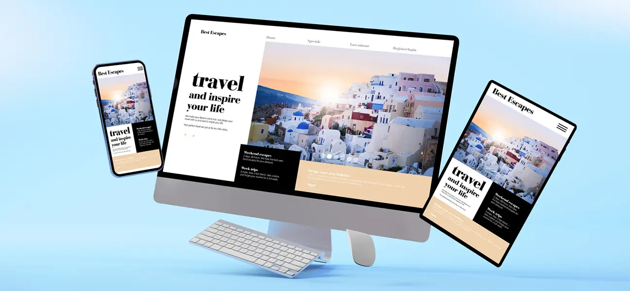
Maintain a consistent experience across all devices

You must embrace responsive web design and it is important to be acquainted with all vital tips for responsive web design. The user experience has to remain consistent across all types of devices. They may access your website through smartphones, tablets, desktops and other devices. In all these cases, the UX design should provide a similar experience to your customers. Regardless of how the users visit your site, they should get similar features on all the platforms. This is what professional web designers typically keep in their mind.
Change the color of visited links

This is one of the basic web design principles. The links are the key tools for navigating from one page to the other. You need to incorporate a mechanism, where visited links change their colours. This will provide the customers with greater ease while moving around the website. They would not like to visit the same page unintentionally. It helps the visitors to understand their present and past locations. Also choosing the right color scheme for the website; perfect color combinations will enhance your website and branding.
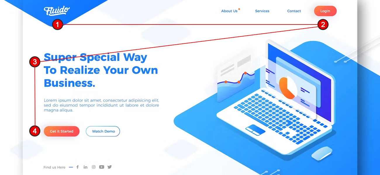
Make your pages easy to scan

Customers spend very little time on a web site, unless you come up with a compelling element. The users are likely to scan through your pages, and not read them line by line. As a designer, you should make the presentation of the site visually appealing, so that the visitors can easily scan through them. Concentrate on the focal points, like the navigation items, login forums, screen titles and other important elements in the website.
Check the links

A broken or non-functional link may frustrate your customers. While developing, you need to keep a check on the links. The users should be able to get across to the pages they want while navigating through your website. This is the key for effective website design.
Make sure all the clickable elements are differentiated

Most of the visual elements like underlines, link, button that are looking like one, and it can easily create confusion for the users. Website visitors need to know, which area of the page is plain text which are clickable elements.
Choose typography carefully

Using Typography is tricky and one has to be cautious the way it is utilized for their crucial works. For, this particular tool has the power to transform a design in either positive or negative manner. Hence one should give enough space for thought process while choosing a typeface. To be on the safer side, it is advisable to stick to only 2-3 typefaces within a design. This is one of the basic typography rules for websites. Infusing too many font types and multiple colors may not look attractive and the design will fail to make a good impression.
If you have very less creative abilities regarding typography, then it is better to go for the common typeface that is compatible for web world as well as has varied weights. This default choice is safer and helps to maintain a consistent pattern throughout the entire design; giving you the option to bring variation between the headings and content.
On another note, one can effectively weave in some creativity by using different kinds of typefaces. But for that one has to be sensible enough not to go overboard and maintain a subtle set of choices when it comes to typography fonts for websites.
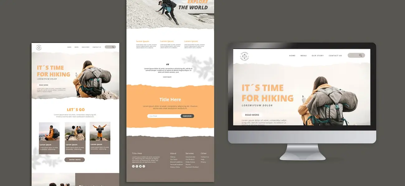
Add white space

A cluttered design with a lot of different elements of web page looks harsh, confused and will not serve the purpose for which it is created for. Too many bright colors, striking graphics and poor typography, together can be totally devastating. The secret to fix this is by bringing in some relief through strategic white spaces
This is the main reason why we stress on maintaining clear and limited design thereby allowing users to utilize the online platform effectively with less interference from more lurid elements. They can effortlessly browse without having qualms of dealing with irrelevant information, pop-ups, graphics and many other unnecessary visual elements. Users mostly prefer a web page that is simple, has clarity, designed quite impressively and most importantly has accurate information and details for further usage. Beyond these things, let the white do the rest of the talking.
-
Pay attention to your content

You should pay attention to both written and graphical forms of content. Nowadays, websites use the graphical form of content more than texts. So, no matter whether you are using images or text, content is equally important to website designs.
While adding content, make sure that it is relevant. It will avoid confusion and ensure that your visitors get a clear idea about your offerings. When it comes to text, write in a simple and clear manner without including jargon. Make sure that it is readable for all types of users.
-
Label button according to their work

Your buttons should clearly tell what action they are going to perform when clicked. This will make your users comfortable with taking the action.
Be specific and do not put vague or abstract labels on the buttons. These do not provide much information on what it will trigger and will more likely restrict the audience from clicking it.
Website Design Don’ts:
-
Don’t make your visitors wait while your content loads

You may have done a lot of research on how to do web designing effectively. But not matter how exceptional the design is, if it takes a lot of time to load, everything else is futile. On an average, a customer moves to a different website when the loading time is more than 3-5 seconds. Make sure that your site loading speed is fast. Consider graphics and design elements in it, and optimize their size, ensuring that the site loads in quick-time. You can also do this by compressing CSS and JavaScript files to reduce site load time.
The internal links should not open in a different tab

The customers expect to get back to the previous page by clicking on the ‘Back’ button. When an internal page opens in a new tab, this option is not available to the users. This also opens a number of tabs in the screen, which the users may not like. Design your website in a way, that enables the visitors to open an internal link in the same tab.
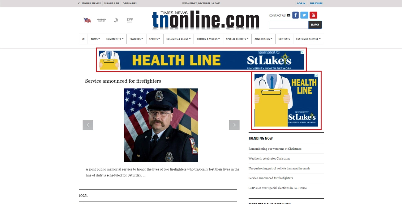
Do not emphasize too much on promotional materials

Remember, the content on your website should stand apart from the other elements in the page. Do not let the promotional materials overshadow your content. Place the advertisements judiciously in your website, so that they do not mess up with the essential elements in it.
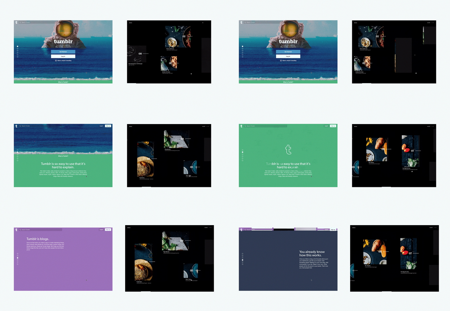
Do not hijack page scrolling

Certain sites are designed in a way, where the scrollbar behaves differently and includes animated effects. They may also include fixed scroll points and a redesigned version of the scrollbar. This is one of the most frustrating issues that users encounter in a website. They should have a complete control of the scrollbar, which should not behave in its own way. Make sure that the scrollbar in your website functions normally.
Do not play with audio and visuals

Websites containing auto-play music, background sounds and videos annoy the users. You need to use them sparingly, only in areas where the visitors expect them. In case you want to incorporate a video into your website, let the users play it on their own.
Don’t take conventions for granted

To stay unique and creative, designers tend to overlook the advantage of conventions. The very purpose of a webpage is to convey relevant information that a user is looking for without confusing them or taking them on a merry-go-round before sharing some specific detail. This particular objective is met by a conventional web page.
A user will get easily familiar with a conventional web page. It can easily guide them on how things work when clicked on certain areas of the page.
The user will easily lose track or interest if he is made to go in circles to find small information on a web page or persistently kept engaged in guess works.
Regardless of the various graphic design trends these days, you can stick to the norms of conventions for better results. Your webpage will strike an instant chord with users by helping them with their quick search and will keep them interested in your page forever.
-
Don’t compromise on the site’s functionality

Apart from this, take care not to compromise on the functionality of your site for the sake of aesthetics. The background behind your content should not be too busy or moving, which captivates the attention of the users.
Besides, poor choice of colors in the background or foreground may also cause stress to the eyes of the readers. So, maintain a good contrast, delivering a pleasing experience for the readers to go through your content.
Also, make sure your website background visuals should enhance the branding and user visitor experience but not too dominant. There are some proven tips to enhance user experience and established web design principles for designing websites and you must follow those steps to increase user presence.
-
Don’t offer more choices

You may try this to help your customers but offering a lot of choices will only confuse them. It will also result in delaying their decision-making process. Also, they might not even take an action.
So, ensure that your website design does not have it. If putting choices to your website is compulsory, then minimize the number of choices you have displayed.
Don’t add too many colors or typefaces

A website design needs to have balance in colors. Using more colors will be difficult to maintain a balance. Besides, it will express a lot of things, which the visitors won’t be able to keep up.
Similarly, using too many variations in typefaces can be distracting and confusing. Sometimes, it will be even annoying to look at. So, try not to use more than three typefaces with three different sizes.
-
Don’t use generic images of people

We more likely pay attention to human faces. Looking at faces helps us stay connected and make the services seem genuine.
However, while using the images of people, make sure that you don’t use the general ones you have found online. This will rarely add value to your designs and can deteriorate the user experience.
Conclusion
These web development do's and don'ts guidelines will enable you to design your website in a way that attracts the customers, engages them and results in greater conversion levels. If you are least confident to craft a website yourself, there are several expert companies offering, web design and development services that can assist.

