15 Vector Illustration Tips for Marketing Materials
After you launch a product or service, you want to get in promoted and grab more customers for it. The more innovative you are better will be the results. This never means that your marketing strategies should always be complex and expensive; simple plans and inexpensive methods can also be effective.
Irrespective of your work philosophy and methodology, software or tools used, the concept or the central idea always occupies the centerstage. The illustration tips for beginners shared over here may be in your knowledge, but even if a single insight about vector illustration styles can add mode value to your artistic collection, the same would be manifested in the form of wide ranging outcome.
It is desirable to factor in the advices offered over here to optimize on the potential of Illustrator so that you can add cutting edge to your new promising illustration concept.
15 Essential Vector Illustration Tips to Elevate Your Marketing Materials
Deliver image in desired format
You need to know the format in which your client desires the final image to be delivered. If you have been asked to provide the vector illustration file which carries a number of layers, transferring the layers individually to a new canvas can be cumbersome. To avoid this, just trace a rectangle large enough to cover the finalized image in Illustrator, press Ctrl+right click and then choose ‘Create a Clipping Mask’. The artwork would be cropped to complement the size of the rectangle drawn.
Optimize on the bezier tools
The Pen tool can prove to be very handy if you are planning to work with a Wacom tablet. The learning time for the Bezier Curves can be high, but once mastered, you can efficiently accomplish shapes and lines in the exact manner you have wanted. Avoid copying and pasting, instead press the Alt or Option Key for dragging off a copy. Learning the shortcuts provided for various functions of the tool can save your time significantly.
-
Take The right approach
You need to strategize the process with right illustration tools to pull off desired effect in stunning manner. It is evident that a full page multicolored image intended to be printed on a glossy magazine page has to be produced differently compared to spray painting done on the wall. The illustrations purported for wall decals need to be one dimensional with simpler shapes which would make it easier for cutting out. Basic shapes have to incorporate within simple styles.
-
Use relevant shapes only
In order to reach the graphical conclusion you have visualized, never be hesitant to prune off those elements which are interfering with your idea of perfect composition. Accomplished illustrators often invest quality time thinking about the image before starting the process. You may experiment with lines and shapes and then cull the ones that suit your concept optimally
-
Deliver the final image in TIFF format
It is desirable to start working from the very outset in CMYK. Even if the finalized image is in vector form, it is advisable to deliver it in TIFF format. With TIFF, you can steer clear of all color related problems and unwanted moderations in composition.
-
Work in an uncluttered space
It is easy to develop a clutter on the Illustrator file considering the fact that a number of layers would be used in the image. You need to work with Selection, Direct Selection and Pen tools of Illustrator. Otherwise, the wide array of useful tools offered by the software would interfere with your efforts to execute a stunning piece of artwork. Keep it neat and simple.
-
Sketch your idea on paper
Before starting with the actual project on Illustrator’s canvas, you must trace out your vision on the sketchbook. Once your ideas would be scribbled on paper, you would have all the fragments of your visualization placed side by side. This would help you in experimenting with different ideas and making observations. Whatever pops up in your head, note it down. Sketches and ideas form the base of the image during the planning stage. On Illustrator, you are actually capturing that image with proper layout.
-
Gain expertise of the pathfinder tool
The Pathfinder tool has lots of potential which can be leveraged for building shapes in quick, easy and smart manner without requiring the time consuming usage of Pen tool.
-
Consistency is paramount
Whatever you do on the Illustrator’s canvas, it should be consistent with the central theme of your style. Addition of an array of diverse styles, the authoritative quotient of the illustration would be compromised with out of place shapes. Your signature style should be visible in every vector component within the work irrespective of the size for maintaining consistency.
-
Refrain from using irrelevant tools
Achieving digital photorealism with Illustrator is not difficult considering the rich resources in the forms of gradients, gradient meshes, glows, shadows etc. available at your disposal. But since you have innumerable options, you should not experiment with them or invoke each tool. If your intent is to create a dramatic effect, you may take resort to Photoshop, collage methods or use readily available compositions.
-
Never ignore the intended audience
You should never lose sight of the audience for whom the final image is intended. The message of the client should not be obscured within the brilliance of the image. The image must convey the right message by reaching out to right audience. Carry out proper research to learn about the temperament of audiences. Never let your personal preferences to take precedence.
-
Abstain from using stock vectors
It is not desirable to depend significantly on stock vectors while making your image. Their remarkable overuse makes them clearly evident when they are deployed within a piece of vector art. It is beneficial to steer clear of them for producing unique and appealing images for your project.
-
Don't use the eyedropper tool
While using a vector illustration for the purpose of modifying or enhancing it, if you feel the need of sampling certain colors from concurrent images within the vector file, you should essentially steer clear of Eyedropper tool for seeking a color from the other image. This is because each CMYK would exhibit strange value which would confuse you.
-
Avoid using the trace tool
The Auto Trace tool provided within the Illustrator may seem handy to use, but it is better to shun the same as the outcomes would inevitably have an obvious and unprofessional feel to them. The same holds true for trace shapes usable within the drawing. However deftly you may have used the tools, the results would be cookie cutter sort. Always use the live trace illustrator mode for producing original and unique images.
-
Scrutinize the final image for last minute changes
Once you have invested significant time and effort to concentrated work on the image, don’t send it right away to your client. Come back to the image after a gap with a fresh perspective and you may be able to spot the spots which would need final retouching.
List of marketing materials which can benefit from Graphic Illustrations
Companies these days make use of every possible mass media to communicate with their prospects. From among the varied options available, graphic illustration is the one that if optimally exploited assures best value for ROI. Underlying are the materials that can be made more operational using some sensible graphic illustration tips.
-
Logo designs

Logo is what people remember first when they think about your company and hence it holds more significance than anything else. It reflects the professionalism and credibility of any company and hence illustrations must be judiciously used when it has to be applied in logo designing.
-
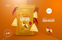
Flyer designs
This is an operative tool that is used when a product is launched. Within the limited space, the main messages have to be incorporated and creatively making the best use of illustration in graphic design of flyers can serve the purpose.
-
Postcard designs
A bit different from flyers, postcard is in fact a promotional material that has more illustrations in it. Businesses can use this for launching any new product and it may be through a series of graphic artworks.
-
Leaflet designs
One of the most attractive features of leaflets is that they are easily deliverable owing to its compressed size. It usually is a single page material having minimum information and delivers instant message. In a leaflet, there is no need to detail the company; talking only about the concerned product is enough.
-
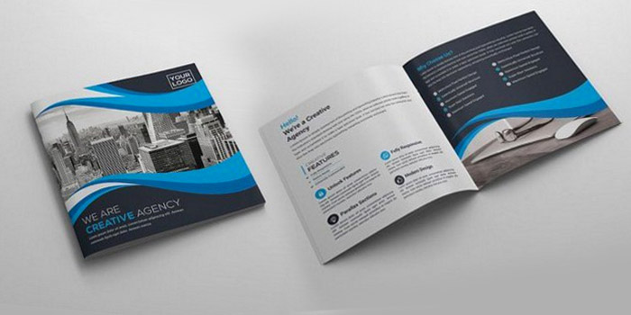
Brochure designs
This can be really descriptive and there is a huge scope for using graphic illustration in it. You can explain more things via a attractive brochure design or innovative brochure design. It has to be made sure that brochures are properly arranged and perfectly designed. Even the minutest of details like colour combinations, fonts, size and even print quality needs consideration. Layout has to do complete justice to the actual purpose of brochure. Brochures can be of different types and you can get advice from a professional


Conclusion
Marketing materials or collateral must always be top-notch. Because they represent your brand. Collateral like logo brochures, flyers, envelopes, catalogs, must strongly abide by your corporate brand guidelines. Only then you can ensure brand recognition and credibility, and instill trust among your target audience.
We hope that this article provided you with an in-depth insight about the vector illustration process. However, seeking help from an expert company availing professional graphic design services always keeps you in the safe zone.