
Web design services by professionals deliver well-designed websites that boost credibility, user experience and conversion rates. Websites are important first points of contact for customers, so they have to be well-organized and visually engaging and MAPSystems can help you create custom websites that match your brand.
Our web design services develop sites with intuitive layouts, responsive design, structured content flow and performance-focused elements to ensure discoverability and user-friendliness. Outsource your website designing to MAPSystems to get sites that perform well on any device.
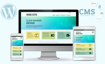
We offer CMS(Content Management System) website design solutions, including timely updating of content and using different design templates. We use the best CMS platforms, such as WordPress, Drupal, Joomla, Magento, etc.

We design static and dynamic websites and provide professional website design solutions. We help small enterprises with static website design to help them create an online presence. We provide dynamic website designs to large companies.
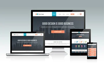
When you use our responsive web design services, we ensure your website is compatible with multiple devices, like desktops, laptops, and mobile phones. We create user-friendly layouts to boost search rankings and website speed.

Our experienced developers cover all the bases of website design requirements, from developing the website layout to bug fixing to creating graphics. We choose the right design elements to make sure that your website attracts more traffic.

We offer custom e-commerce services and create modern e-commerce website designs, integrating payment gateways. We are experts in e-commerce marketplace development, shopping cart development, and payment gateway integration.
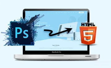
Our team of professionals provides exceptional quality in converting PSD layouts into preferred web design frameworks. They are proficient in the use of various technologies and can handle the design as per the W3 Standard guidelines.
 HTML5
HTML5
 JS
JS
 JSP
JSP
 Angular JS
 CSS3
CSS3
 ASP.NET
 Python
 PHP - MySQL
Our capability to adapt to evolving technologies and our competency in diverse domains, make us the most trusted website design service provider. Following are a few more reasons why one must choose MAPSystems for all website design requirements!
Since the website is a representation of the business, we dedicate our time and effort to learning all about the client’s business and the industry they are in so that we can create the appropriate design for their needs. As a website design company, whether we are making modifications to an existing website or creating one from scratch, we make sure to optimize it and make the site more search engine friendly.
We use the latest software and tools to design intuitive website layouts, compatible with all the leading technology frameworks.
Our website design pricing is cost-effective and affordable for all. This makes us the go-to choice for businesses of all sizes.
We offer our clients 24*7 tech and customer support whenever they require our assistance and quickly resolve their issues.
By implementing a safe and secure FTP server for all file transfers and data sharing, we ensure 100% client data protection.
Here at MAPSystems, we value customers' time and urgency. Hence, we keep our project delivery timeline as short as possible.
MAPSystems is an ISO-certified creative organization. Therefore, we maintain global quality standards in all our projects.

Contact us and we will provide you with the best website design services that abide by the latest technology standards for driving more customers to your site in order to improve your business.
Contact UsTo design and format bimonthly and quarterly issues of interior designing magazines...
READ MOREMAPSystems offer superlative logo designing and vectorization services...
READ MOREThis case study is about designing the menu of a restaurant for an established online printing company.
READ MORE


The MAPSystems web development team did my website really well. I appreciate their dedication and creativity. Being a photographer, I wanted my website to look innovative, and the developers exactly did what I always wanted. Thanks team.
I am highly impressed with the stunning eCommerce website MAPSystems designed for my luxury cosmetics brand. It looks perfect and has all the necessary traits of a modern online store. Thanks guys!
MAPSystems redesigned our website, and it has significantly improved both our brand perception and customer engagement. As far as UI/UX is concerned, the new site is clean, mobile-friendly and easy to navigate.
Feel free to contact us at any time. Our sales team will get
in touch with you at the earliest.
