What are the essential elements of the book cover? A strong book cover is not just about aesthetics - it is a powerful marketing tool that can make or break the reader's decision to make your book. Within a few seconds, potential buyers create an impression based on colors, fonts, images, and layouts.
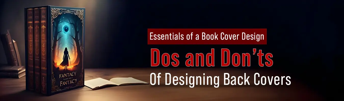
This is why understanding of book cover design elements is important for authors and publishers. A well-designed cover not only communicates style and tone but also creates trust and professionalism. In a competitive market, the right design helps your book stand out, attracts attention, and finally sells more.. In a competitive market, the right design helps your book stand out, capture attention, and ultimately drive more sales.
Essential Elements of a Book Cover Design
-
An enticing title and clear author name
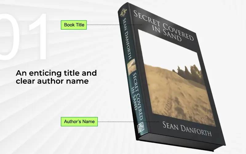
Titles and author names are pretty obvious necessities for a book cover. How else do people know what the book is called or who wrote it? The title usually occupies a prominent portion of the book cover design, and the name of the author is placed above/below it, or at the bottom of the front cover.
The title, as well as the author’s name, traditionally appear on the front, back, and spine of the cover.
Since it is the main component of the design, the title needs to be catchy, straightforward, legible, and easy to remember. That’s why you’ll see many books with really large, one-word titles (see below).
-
A vivid subtitle
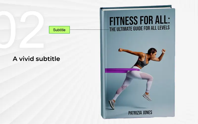
A subtitle is the small line of text that accompanies the book title. While the title is the hook to get you to pick up the book, the subtitle is the closer. Its job is to give you more information about the book in just one clear sentence (see below).
Subtitles are not a rule, however, as not all books have them on the cover. They’re more useful for clarification when the title is a little too obscure.
-
Captivating imagery
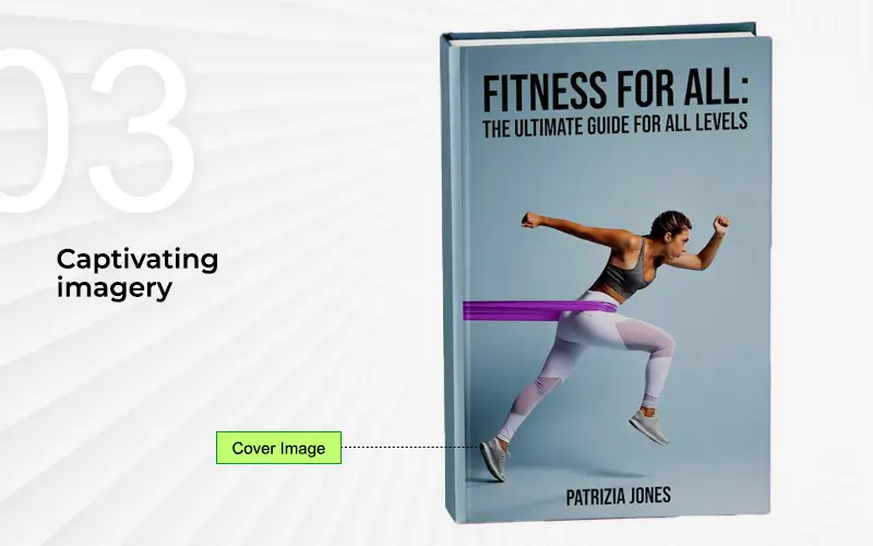
The only other element on the front cover of a book that can be considered equal in importance to the title is the imagery. Whether it’s a photo, digital art, or illustration, the imagery has to be visually appealing to pique a reader’s interest. Of course, the image doesn’t work all by itself. It works along with the title and subtitle to catch eyes. But good-looking, quality imagery (along with interesting colors) really is what the eye notices first.
-
Appropriate typography and font choice
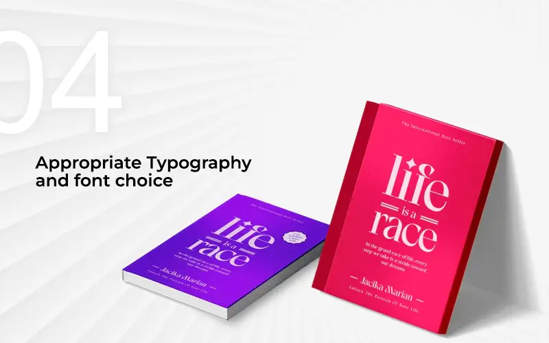
The typography and font basically deal with the style of any text on the cover. The typography is different for the book title, subtitle, author’s name, and any other text on the cover. Normally, the title is the one with the most stylistic typography when compared to the rest of the text. And, it is also the largest font on the book cover. The typography of all the main text – title, subtitle, and author’s name – has to match the overall design of the cover. It should also match the theme or genre (fiction, non-fiction, thriller, or romance) of the book.
-
An eye-catching spine

The look of the spine is important – for printed books – as this is what the potential reader sees when they are browsing through books placed front-to-back on a shelf. Think of books in a library. Keeping books front-to-back saves a lot of space and makes room for other books. Books are rarely placed side by side with the front cover fully exposed to the viewer.
You’ll see this kind of placement only on magazine stands or on special stands where new/popular books are featured. These spots are typically paid, as they are situated in prominent locations in a bookstore or library. But you can’t pay for your book to be featured on these stands for a long time.
Having the title and author’s name on the spine of the cover makes it easier for the reader to find the book. And, it also helps the owners of the books organize them according to their preferences. An attractive spine will attract people even when they can’t see the front cover.
-
Well-thought out cover design and layout
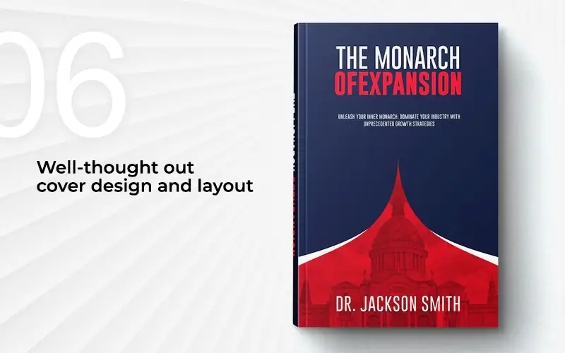
The overall design of the book cover has to be in sync with the theme or genre of the book. If it’s a thriller, the design should evoke those sentiments from the person when they see it. The colors should be dark and moody and elements in the design can hint to the plot or themes in the story (like a shadow, knife, or cryptograph). A romance novel, on the other hand, would require softer colors and imagery that evokes a sense of romantic connections.
The layout of the design must be a good combination of typography and imagery so that appropriate focus is given to each of the elements. For example, the name of the author or the subtitle should not overshadow the title of the book. A good understanding of your target audience will help you prepare the design accordingly.
-
Endorsements and reviews (if any)
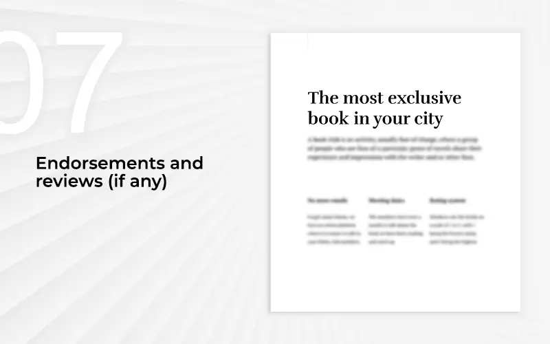
It would be best to include well-known critics or newspapers who have reviewed your book on the book's cover. It’s one of the best ways to market your books, as many people look for reviews and recommendations before they buy a copy.
Preferably, you should feature the review in an area that the reader won’t miss. While most cover designs make room for reviews and endorsements on the back of the book cover, you can put them on the front page too. The best way to do it would be to put the shorter version of the review up front and the full review on the back (see below).
-
Well-placed author bio or synopsis
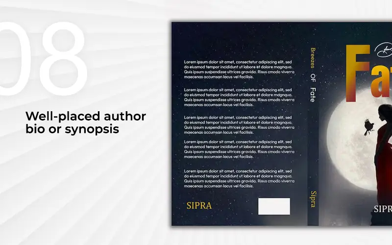
The author bio is an important section on the cover, normally found on the back. It’s the section where you tell potential readers who you are as a writer. If you have had a long career as an author, your bio may be about a paragraph long. If you’re relatively new, about three sentences will suffice. Here is where you can also let readers know where to find you (by email, blog, or website address). Below is a good example of an About Author section:
The content of your bio will also depend on the genre of the book. If it’s a fiction novel, you’ll do well to establish your author’s persona. In the case of a non-fiction book, it’s better to present yourself as an expert on the subject by referencing your qualifications and work history. Remember that you’re not just selling your book but also yourself as a writer, so you need a well-established author brand.
A synopsis, on the other hand, always appears on the back cover. This section gives the potential reader a gist or introduction to the book. In the case of a fiction book, it gives the reader the basic plot of the story, maybe introducing a main character(s). If it’s a non-fiction book, it could introduce the topic. It gives the potential reader just enough information to get them interested in purchasing/reading the book.
-
Consistency in branding (for a series)
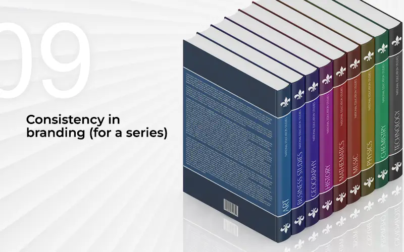
If your book is part of a series, or you are about to start a series of novels, it would do you well to maintain consistency in typography, colors, illustration style, or certain design elements. Take the Harry Potter book series, for example, as seen below.
You can see how the names “Harry Potter” and “J.K. Rowling” are in the same style across all seven books, even though the colors and fonts of the rest of the title are different.
Maintaining consistency across a series makes each book recognizable as part of the series. If a reader has read a book from the series before, they’ll be able to identify a new addition to the series just from the cover.
-
Genre-appropriate design
A cover should instantly connect with its audience by reflecting the book’s tone and subject matter. Ensuring a strong genre fit allows readers to recognize the style they’re drawn to, whether romance, thriller, or nonfiction. This alignment builds trust and makes the design more persuasive when competing for attention in a crowded marketplace.
-
Negative space & composition
Thoughtful use of negative space prevents overcrowding and gives breathing room to the title and imagery. Balanced placement of elements creates harmony while establishing a clear visual hierarchy. This approach helps the eye flow naturally across the design, highlighting what matters most and ensuring the overall layout feels professional and polished.
-
Emotional triggers in colors/fonts
Colors and typography act as silent messengers, sparking emotions before a single word is read. A carefully chosen palette or typeface can evoke suspense, joy, or nostalgia, setting the mood immediately. Considering these emotional triggers ensures the cover resonates on a deeper level, creating a memorable first impression for potential readers.
Together, these principles strengthen any book cover design checklist, helping authors and publishers craft covers that attract attention and inspire curiosity.
E-book vs. Print Cover Differences
| Aspect | E-book Cover | Print Cover |
|---|---|---|
| Size & Format | Optimized for digital screens; usually a single front cover. | Requires front, back, and spine; follows standard print dimensions. |
| Resolution | Designed for on-screen clarity (72–150 DPI). | Needs high-resolution (300 DPI) for quality printing. |
| Details & Text | Minimal text; bold, clear fonts for visibility on thumbnails. | Can include detailed text like synopsis, ISBN, price, and publisher info. |
| Design Focus | Strong visuals and striking titles to grab attention in online marketplaces. | Balanced design across cover, spine, and back to attract in physical stores. |
| Interactivity | Static image, but optimized for digital browsing and quick recognition. | Tangible feel; finishes like matte, gloss, embossing, or foil add value. |
| Distribution Needs | Must comply with platform requirements (Amazon Kindle, Apple Books, etc.). | Must follow printer guidelines and trim/bleed settings for accurate printing. |
Dos and don’ts of designing a book back cover
The front cover of a book is often what most authors focus on, and rightly so. But just because the front is what most people pay attention to, that doesn't mean the back cover should be neglected. Simply slapping on some reviews, a synopsis, and an author bio isn’t enough. As a self-author, this is a very important bit of real estate you can be using to promote your books and yourself.
So then, let’s look at some of the dos and don’ts of designing the back cover of a printed book.
Do:
Use a limited amount of text on the back cover. You only have space for about 200 to 250 words on the back. Too much content will force you to use uncomfortably small font sizes to fit all the text. The large amount of content will also overwhelm potential buyers. They may get put off by this and place the book back on the shelf without even giving it a chance.
Check out other books in your genre and see what their authors have done with the space on the back cover. Pick out the best elements, combine them, and tailor them to your style.
Keep the synopsis short. If possible, keep the summary of your book to one paragraph; two at the most. If it's a fiction novel, include points from the plot that are the most intriguing. If it's non-fiction, make a bullet point list (three to five points) of the main features. Explain to the reader what your book can do for them or what they can learn from reading the book.
Use a picture of yourself in the About Author section. Get professional headshots of yourself to use in this section. Most authors present themselves in an elegant and sophisticated way. But you’re free to express yourself in any way you see fit. It can align with who you are as a person or fit in with the theme of the cover design. As much as possible, make sure that only you are in the photo.
Tailor the author's bio to the book’s genre. For a non-fiction book, add a few points to show your expertise on the topic. For fiction books, you can talk about any previous books that did well, or about your persona as a writer. You can also add your blog/website/email address so readers can find you.
Get someone well-known to write an endorsement. For fiction books, try to get a renowned author from the same genre to write you a brief endorsement to put on the back cover. For non-fiction, get an endorsement from an expert in the same field.
Don’t:
Make the back cover of the book all about you. You are trying to sell the book, not just your talent as a writer. Focus on showing the potential buyer why they should read your book. The back cover is all about convincing your target audience.
Use clichés like “a must-read” that “will change your life.” The back cover is not a review column. Clichés like this only make potential buyers think that you are being salesy and arrogant. Pull in the potential reader with the interesting plot. Don’t tell them what they should think about your book. Be confident, humble, and state facts about your book. Leave it up to the reader to figure out how good your book is.
Get endorsements from random/unrelated individuals. The endorsement should come from someone recognizable, like a well-known expert (for non-fiction) or a celebrated author (for fiction). If you can’t get an endorsement from a notable figure in your field or genre, it’s better to not include one at all. Not adding any endorsements is better than getting one from just anyone. Endorsements are supposed to give your book credibility. How trustworthy is your book if just any Tom, Dick, or Harry recommends it?
Forget to proofread the text. Mistakes on the back cover, even in the content, are unforgivable. Once the books are printed and put on the stand for sale, it is too late. Spelling and grammatical errors can be off-putting, especially when they are staring at you right from the book cover. Language errors aren’t as common on the front cover as they are on the back. So, you need to check and re-check the back cover. Get someone else to help you proofread your text. We all know that it can be difficult for one to proofread one’s own content.
Conclusion
A well-crafted book cover is essential for making a strong first impression—it combines a compelling title, a clear author name, a vivid subtitle (if applicable), captivating imagery, genre-appropriate typography, a thoughtful layout that includes the spine and back cover, and a purposeful use of space and contrast.
These book cover design tips ensure the cover not only grabs attention but also reflects the book’s essence. Leverage professional graphic design services to enhance visual storytelling and maximize appeal, ensuring your work stands out in a crowded market and communicates its message effectively.
Ready to elevate your book’s visual impact? Contact MAPSystems today to get started with a custom design solution that matches your vision.
A strong book cover includes clear typography, balanced composition, genre fit, and compelling imagery. Together, these elements grab attention instantly and convey the book’s mood. Without these essentials, even great stories may struggle to attract readers.
Avoid cluttered visuals, hard-to-read fonts, and irrelevant imagery. These mistakes confuse readers and dilute your message. Simplicity with purpose works best—every element should add value and guide the reader’s eye effectively.
Typography in book covers sets the tone. Bold fonts suit thrillers, while elegant typefaces fit romance or historical works. Fonts must remain readable across print and digital formats. Poor font choices can instantly weaken credibility.
Color psychology shapes emotions. Red suggests passion or danger, blue builds trust, and black often signals mystery. Choosing the right palette ensures readers feel the intended mood before opening the book.
Yes, ebook vs print cover design differences matter. Ebook covers must work as small thumbnails online, while print covers allow detailed back covers, spine design, and textures. Each format demands its own approach.
Negative space improves visual hierarchy and readability. By giving text and imagery breathing room, it draws attention to the most important elements. Overlooked by many, this subtle detail can make a cover look more polished and professional.
Yes, book cover A/B testing helps find the design that resonates most with readers. Authors can test covers through social media polls, ads, or focus groups, reducing guesswork and boosting sales potential.