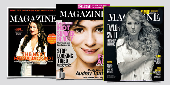
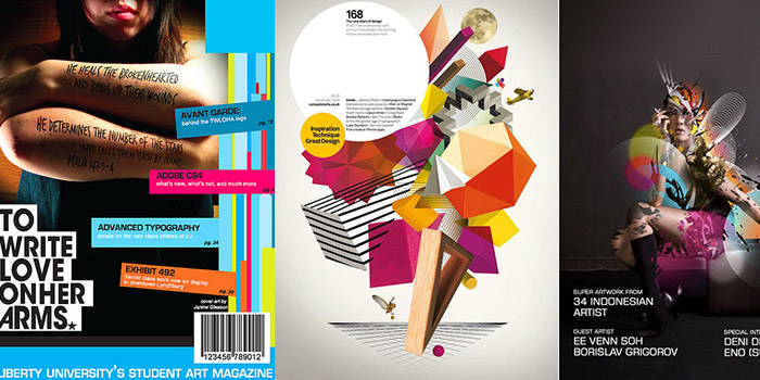
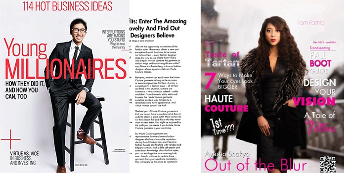
For any designer, the greatest challenge is crafting a magazine cover that engages its reader while serving the purpose and that has a strong focal point. The magazine cover should also reflect the genre and all possible inclusions perfectly.

Use of color and typographic hierarchy and shelf placement play a key role in designing awe-inspiring covers. Arranging texts, touching up photos and a lot more in there in the process. Only a professional can make sure of desired quality and implication in that. Digital versions are rapidly replacing print media but the significance of cover sketch has in fact increased. The reason for the same is that, now people are exposed to more options and the time you have to arrest their attention is minimum.
Some of the magazine covers design tips that can work miracles to create visually appealing magazine designs are discussed below. Let’s have a look.
Use text on design adequately

The text and design should mutually complement. The underlying element of any magazine cover layout, as per expert service providers would either be an illustration or a photograph. It must be assured that the text is readable. For that, on a light background, text must be in dark or vice versa. Most of the companies use proper software for darkening or lightening areas to place texts.
The bolder and bigger text elements of magazine cover demands you to inject appropriate colour. It should not be a randomly chosen one but deliberately decided.
Certain companies offering expert magazine designing services follow a creative approach. They put the design elements in multiple planes. Most of them virtually set up 3 layers.
Design magazine cover by amalgamating different elements shrewdly

To make a cover stand separated from the herd, professional companies offering stellar graphic designing services use a combination of photographs and illustrations creatively. Blending two worlds on a common platform can really be motivating. Some even ignore typographic fonts and use hand-written fonts.
There are service providers who shun away photo centric approaches. They confine to typography or illustration-only cover but for good. Unique style and perfect colour combinations are more important here.
It’s not a rule but being consistent is preferred

Maintaining consistency in the magazine cover designing keeps your brand intact, especially in case of a regular publication. You have enough room for being creative if above tips are effectively utilized by the company in its processes. However if you think that sacrificing magazine design consistency can help you to do something even better, there is no harm.
Ensure the cover lines or sell lines are impactful
This type of magazine cover design includes a message or a statement on the cover page of the magazine. Whether you wish to use few cover lines or fill the entire space with it, the choice depends on the type of magazine you are publishing.
The cover lines are usually written by the magazine’s editor in chief or the copy editors. It may seem very easy, but it takes a lot of time and effort to come up with a line that is appealing and attractive. These texts are mainly given to create a curiosity-building effect in the readers’ minds. Thus, keep them very short and minimal. One pro tip is to use some power words that will hook your audience to turn the page and read inside. Keep the typography of these power words in bold or in quirky call-out bubbles that make them stand out.
A cover line can either be a solution to the problems, a powerful statement, a call-to-action, or some kind of wordplay. If you are using wordplay, be careful with the language. For example, English is good with it but other languages may not be. Also, see that the lines are easy to understand for the readers.
Consider the grids and layouts
This tip is especially for print magazines where the cover story and all other associated content must be inside the grid. Because grids are the backbones of any visual content or design. Grids also help to maintain consistency through the magazine layout. They also create a framework for the content position.
Thus, regardless of which software you use to create the magazine design, ensure the layout has a well-applied grid. This will make the layout more professional. Beginners can start by placing temporary grids in the background of any page while designing. This is an excellent way to check the alignment of the texts, images, and other graphic elements.
Play around a healthy balance of color
Another handy tip for beginners: don’t back off from playing around with color and contrast. Because these are the two visual elements that make a design captivating and eye candy. Just make sure to keep your brand’s voice in mind for an added advantage. If you are a women’s lifestyle and health magazine, try to keep the color soothing, like light blue or light pink, green, etc.
For men’s magazines, use more bluish shades; black can also be considered. Although you may use gender-neutral colors, consider the brand persona and select the shades accordingly.
Select a focus point and build the design around it
This is the last entry in our list of top tips and ideas for creating stunning cover artwork for magazines. Consider the focus story the magazine is going to feature. Is it about a new Hollywood movie? An interesting gossip? A secret tip to woe your crush? How to look great on your next prom night? Is a new cryptocurrency in talks? Or is it about how to tackle teenage kids?
Whatever the focus story is, ensure the cover portrait subtly depicts that. Don’t be too much on the face; artfully design the cover page elements that echo the featured story of the month!
Let the magazine title take the best place
Whichever title you decide to free upon, ensure the magazine issue features that. Put the issue or the topic on the cover through texts. This is not only for hooking people’s gaze, but also give a greater importance to the topic.
Use layout flips
Create a minimal layout and flip the magazine cover. Try to put the entire focus on the background and the topic/title, while sidelining the image. Strategically pushing the image to the sides is a great way to bring the focal point to the main topic.
One-point perspective is brilliant for magazine covers
One-point perspective is a type of linear perspective. It shows how objects become smaller and converge towards a “vanishing point”. One-point perspective is utilized as a graphical drawing method to create a realistic 3D look and feel. Using this method can upgrade the magazine’s cover to a great extent.
Laser-cut designs are the new “in-thing”
Laser cuts are used in various marketing and visual communication purpose. Laser cutting or etching gives the required dimension, shadow, and depth to a design, making it appear realistic. Try this latest graphic design method and hook your readers.
Create designs that showcase sequential motion
Any static design that has the illusion of a sequence or motion, makes heads turn. Likewise, for your magazine cover, showcase a visual that moves in a sequence. Ensure that the typography is minimal that will reinforce the grid lines.
Make the front cover and the background as one
Fusing the foreground of a magazine cover featuring the central imagery with its background, creates a great level of aesthetic contrast. This method adds life to your design and makes it more appealing. Follow this tip to enhance the magazine cover’s composition.
Feature a unique, singular imagery
An impactful visual, a close up of a face, a jubilant smile, a soul-piercing look - all these make up great imageries. These are especially ideal for magazine covers. A great way to enchant audience.
Keep some elements transparent
This is another great tip to outshine your competitors. As a magazine designer and cover artist, you can feature a black and white image as the central figure. Eventually use transparent blocks of color or other shapes overlap the visual. This retains the overall aesthetics of the image, and at the same time, makes the cover look immensely creative.
Conclusion
Creating an inspiring magazine cover is a process that requires time and effort. While the tips above can guide you, understanding your target audience, the focus story, and the fundamental anatomy of a magazine cover is crucial to success. Following these principles will help ensure your magazine stands out and appeals to your readership. For professional assistance, consider reaching out to an expert graphic design services or magazine design agency to elevate your magazine covers.
