Typesetting, the process of arranging the content to enhance the beauty of written words, is also bound by some rules despite being creative. Therefore, typesetting rules and regulations or tips, whatever the term used for the process, should be followed to get the best output post publishing.
While preparing text for typesetting, you might have come across some predefined templates to make your work easy as it takes care of your content from header to footer, suggest the best font and indentation, and provides required margins.
Typesetting Best Practices for Authors: Rules for Professional Formatting
-
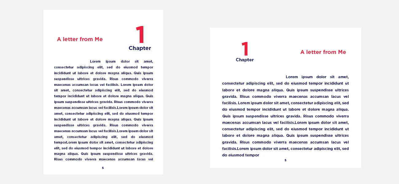
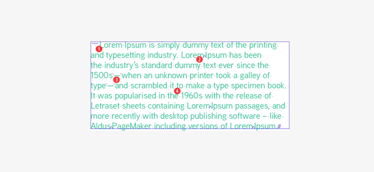
Alignment of Paragraphs
![Alignment of Paragraphs]()
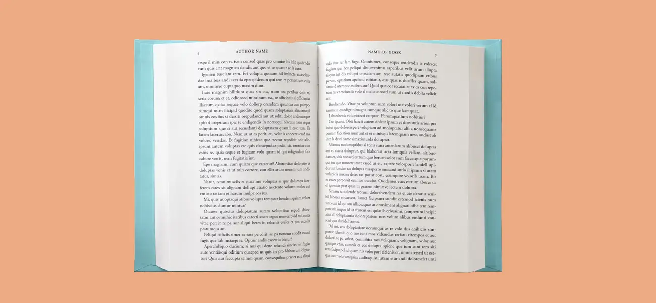
If you have gone through the traditional style of book publishing or if you pick any professional book or writing material, you might have noticed that the content is always in 'justify' alignment.
This is because it gives a more formal feeling to the content and is easy to read. This alignment is apt for long-tail books; however, books with short content always use correct alignment to make them readable.
So, it is up to you and depends on the type of book or writeup you want to publish. Choose what is adapted by the readers easily.
-
Text Style
![Text Style]()
Ragged text can be used to give it a more personalized feel, but if not appropriately placed, it may irk the readers if the ragged text is on the higher side or contains a large volume.
On the other hand, as suggested in the first pointer, you can use justify to give a more formal tone to your text.
-
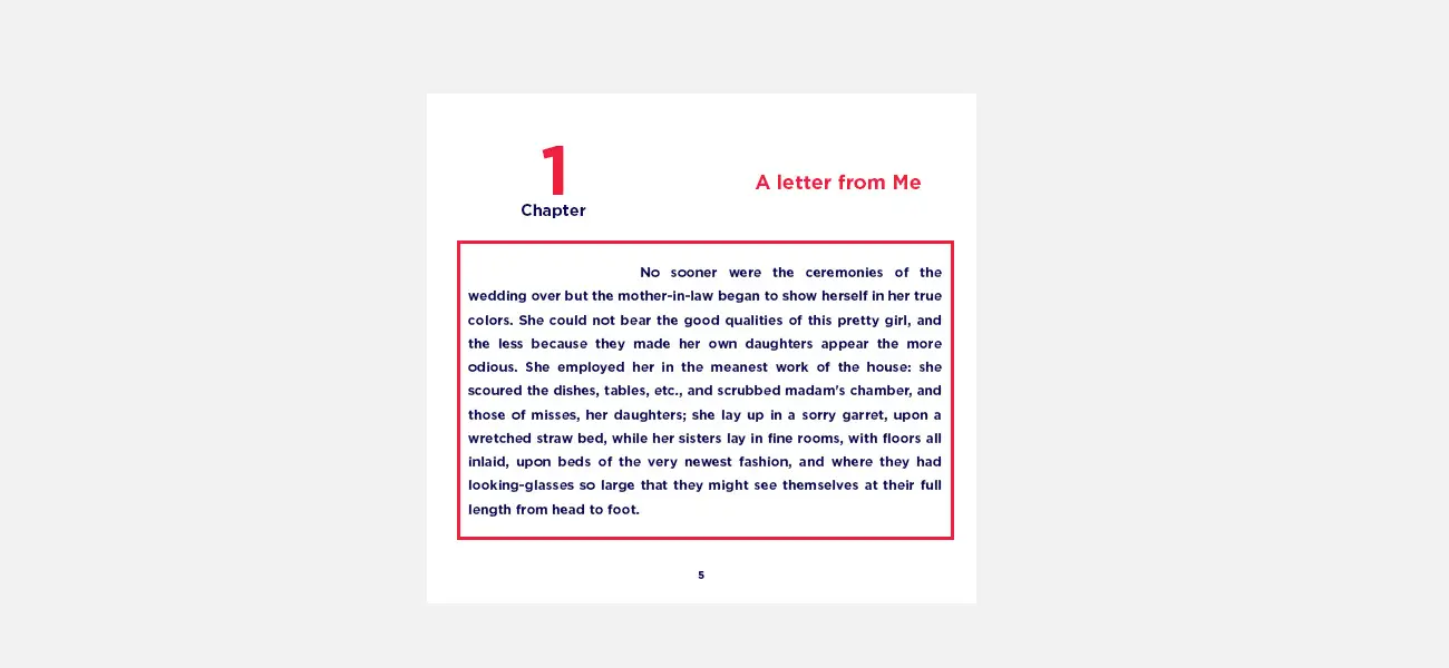
Margins- For Book Binding & Clarity of Content
![Margins- For Book Binding & Clarity of Content]()
We know you are aware of the margins- the blank spaces around your text blocks and their usage to give a clean and explicit content feel and leave the space for binding.
The use of margins also comforts the reader's eyes while going through the lines.
-
Font Style & Size
![Font Style & Size]()
When it comes to book font size and placement, the all-time favourite font style is sans serif as it is one of the most convenient and readable fonts, and the readers quickly recognize words when the content is published in this font.
And talking about font size, using large or big fonts can bring an unprofessional look and feel to the book. Therefore, the ideal practice one should follow while choosing a font size is accommodating 70 characters in one line each.
However, the trim or book size is different for novels and memoirs.
For Fiction novels (80k – 130k) - 5.25 x 8 or 5.5 x 8.5 & For Non-Fiction – 6 x 9
Fonts for novels should be under 11-12 pts.
-
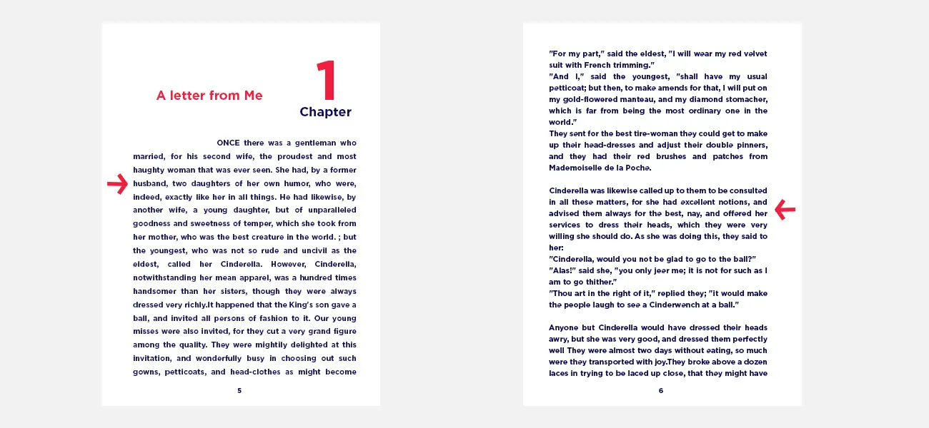
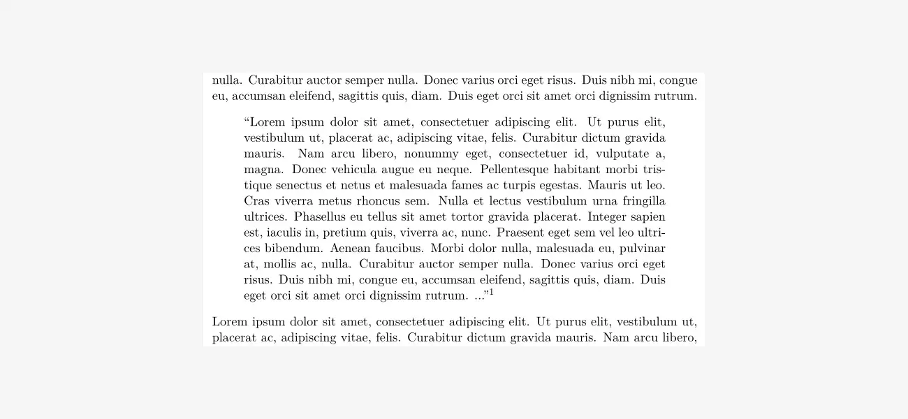
Book Block & Line Spacing
![Book Block & Line Spacing]()
A book block, if explained in simple terms, is a predefined area in which the book's text remains closed or confined tightly. This is a process by which the lines on two opposite pages are lined with each other, and when the book is opened or closed, the words must converge in the same line.
Line spacing in a book is also essential as it provides the proper spacing between the lines and the difference between two paragraphs. This gives more clarity while reading the content.
-
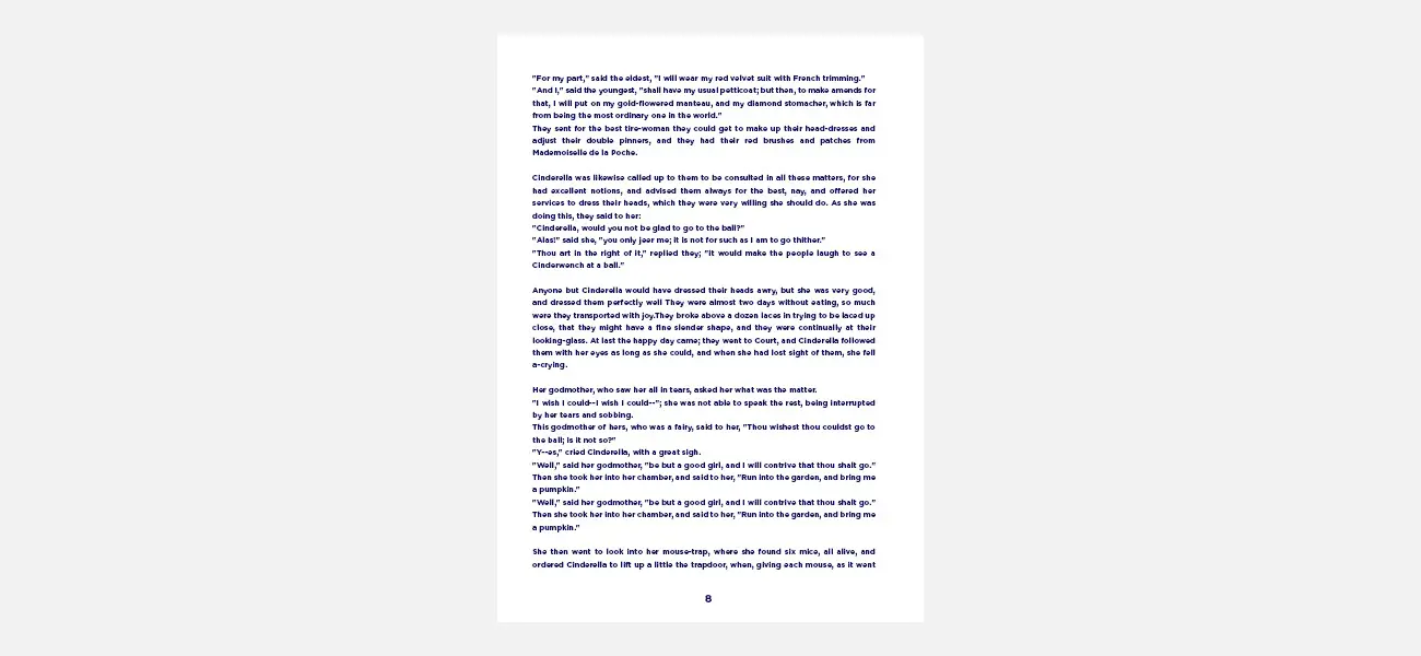
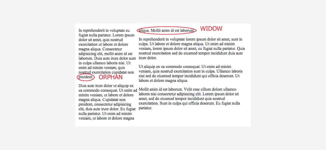
The Widows & Orphans
![The Widows & Orphans]()
Always remember, if your one paragraph has ended and the following paragraph is going to start on the next page, but its first or second line is on the last section of the page, then it is a typesetting blunder.
Neither the first nor the last line of the paragraph should be at the ending of the beginning of the page. This interrupts smooth reading.
-
Words Spacing & Widows
![Words Spacing & Widows]()
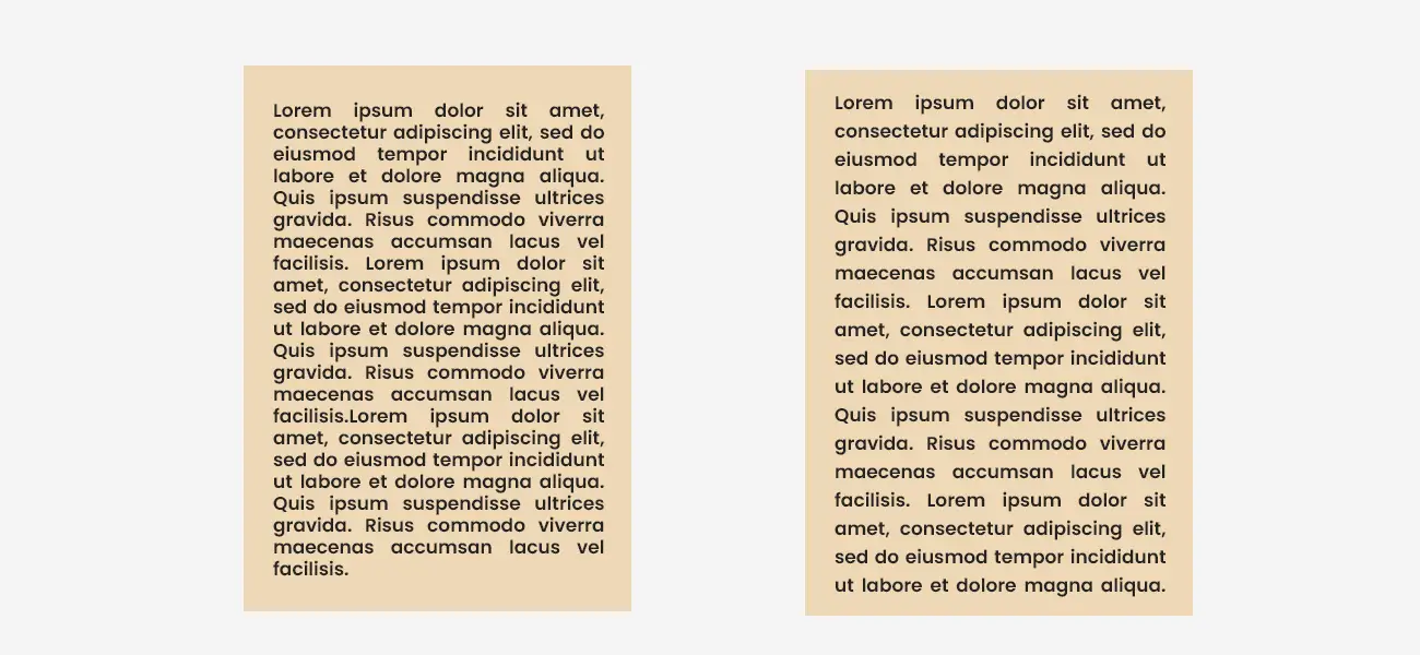
Regarding word spacing in typesetting, it should be optimal and easy to read to book lovers. However, if placed tightly, the spacing may look dark and unclear, and on the other hand, if lines are placed loosely, a lighter feel may create reading issues.
Talking specifically about the ideal number of characters in one paragraph, it should always be more than 5 characters, including punctuation marks for a subtle look.
-
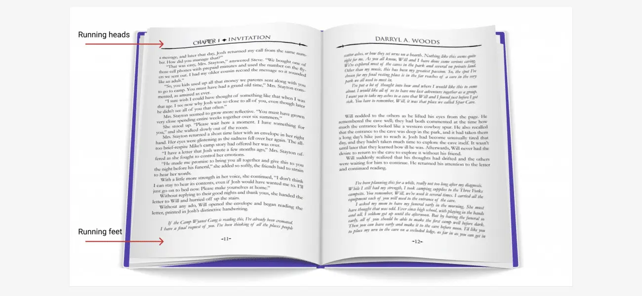
Running Heads & Feet
![Running Heads & Feet]()
In the books, you might have noticed small information about the book, its author or so, and it is called a running head while the other info like page name and number is shown at the bottom of the page in some books is the foot.
While typesetting, one should be very careful in the placement of these two as they might look small or get significantly less or no attention, but that doesn't mean they are of no use. However, if not placed correctly, it may give an unprofessional look to the content placement, and the reader who has lost track can't be able to return to the place where they left reading.
-
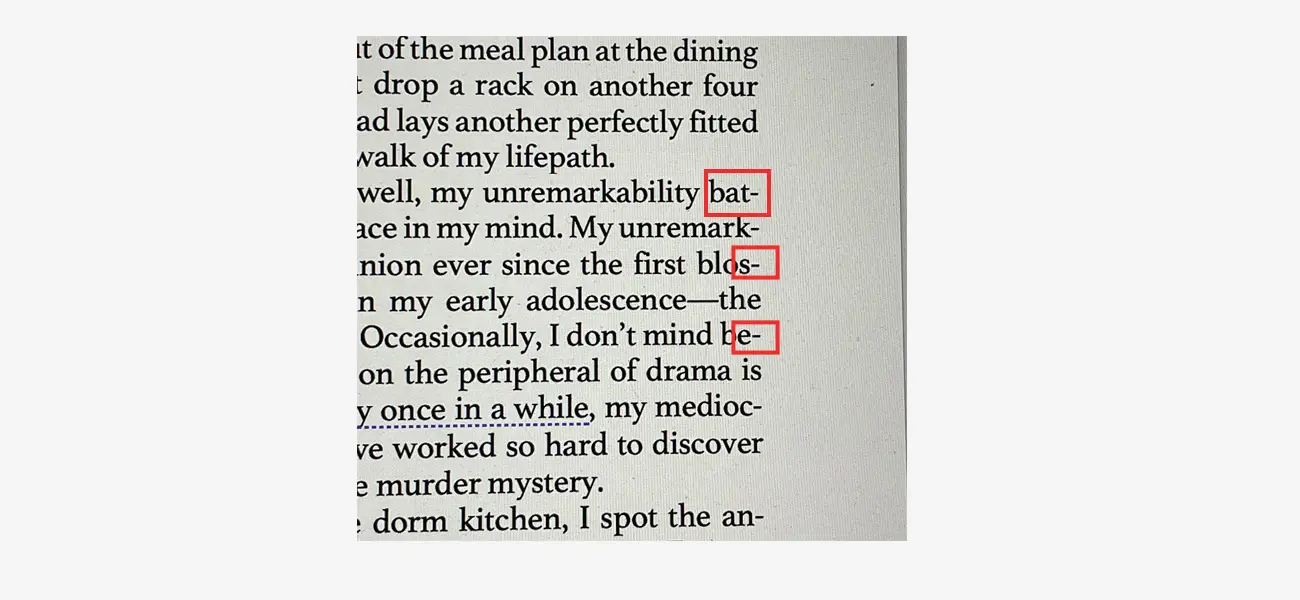
Hyphenation
![Hyphenation]()
Using too many hyphens is pretty annoying from a reader's perspective, and some norms must be followed for using the hyphens in the writeup like the last line mustn't have any hyphens as it may lead to a confusing state for the readers. Also, the use of hyphenation must be avoided for names of people and places and capitalized words.
-
Quotation Marks
![Quotation Marks]()
The use of Quotation marks is a must; apostrophes and curly quotations give more expression to the lines and the idea behind them while writing. Every quotation mark has its importance and must be used accordingly.
-
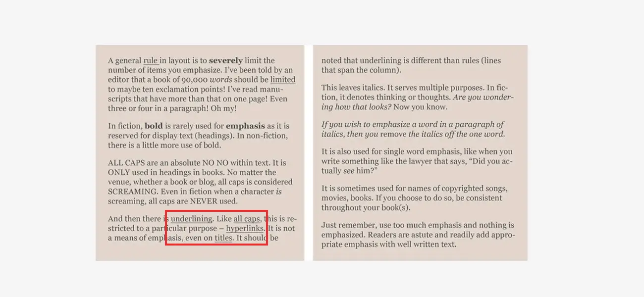
Text Underlining
![Text Underlining]()
One more thing apart from the Bold and Italics, the Underlining of the text must be used less or not being used chiefly; the reason is the same, it distracts the readers.
-
Special Characters
![Special Characters]()
Use of some special characters in the writeup must be avoided or to be used minimum if necessary.
-
Art & Images
![Art & Images]()
While typesetting, one thing which is most important to keep in mind is the place to be planned for illustrations, images or artwork, if your book has to show any.
Italics and Boldface
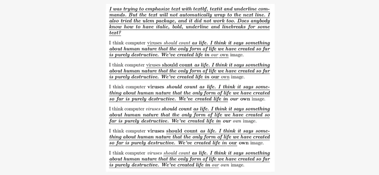
These options should be used less and only where required because the unnecessary or frequent use of bold and italics may break the reading flow.
If these pictures are to be included in the book, then a proper setting and arrangement are to be made to clear any cluttering.
Bonus Read: History of Typesetting!
Conclusion
Typesetting is not just a process; it's a whole different dimension of publishing the writings; with years and years of invention and inclusion of new features now and then, this process has reached new heights and to understand it, one needs time and must realise a proper set of rules to get the best results.
If you need professional assistance to make your book layout look perfect in printing, outsource your requirements to reputed prepress services offering typesetting services.
This brings the topic to an end, and we hope our research has given you sound knowledge.