Strategically designed web pages are vital for eCommerce sites to convert leads into customers. eCommerce websites must have simple and easy-to-navigate interfaces to facilitate hassle-free UX. A fast and easy purchase process must be the main priority for any eCommerce web store design.
If the site design is not optimized, you may lose leads with high conversion potential. Despite online promotions, your eCommerce venture may fall flat if there's no sales optimization. Big-budget online advertisements can prove futile if they fail to attract new visitors.
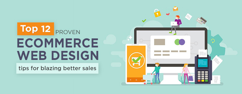
12 Essential eCommerce Web Design Tips to Drive Conversions
-
Tip 1) Always focus on the convenience of site visitors

For any online consumer, easy navigation and a user-friendly interface are priorities. This can only be achieved if the elements are organized in a structured manner. The product portfolio, USPs, social proofs, and order placement must be easily accessible. When all these are structured in the right way,
eCommerce designs must be developed from the visitors' perspectives and their convenience in mind. The site design must enhance their shopping experience with optimum product clarity. Also, adequate shipment process-related details must be included in the design. Each aspect of an online store, such as:
- Product description
- Image
- Contact form
- Discount table
- etc., must be arranged properly. This is the key to making them place recurrent purchase orders with your brand. To ensure that your site’s UI/UX is best-in-class, you can seek a professional's opinion. The areas you should ask them to critically evaluate must include the following:
- Ease of navigation
- Ease of searching desired products with various keyword combinations
- The visual clarity of the products listed
- The conciseness yet propriety of the material description and order placement
-
Tip 2) Adopt the mindset of site visitors
If you want to predict how your site’s visitors would react and respond to the site's architecture and facilities, you need to think like a visitor. You need to browse your site like a prospective buyer to think about things that resonate with audiences. Seek answers to the following questions.
- Can you move around the pages with ease?
- How fast is the page loading process
- Is the search box presenting the right products upon entering various keywords?
- Is the product, upon being clicked, displaying images in high resolution?
- Are the descriptions informative and concise?
- Can you place orders, feed your shipping address, and sign off the cart easily?
- Is the payment gateway page inspiring a sense of safety regarding sensitive financial details shared?
- Has an order/ shipment tracking mechanism been incorporated?
Once you feel convinced that the questions above have been satisfactorily addressed in your site’s layout and architecture, you can rest assured that you offer an experience that optimally fulfills visitors’ expectations.
-
Tip 3) Leverage the power of attractive colors
When colors are strategically used, they can generate such an appeal that site visitors may find it hard to resist. Colors, after all, have a psychological effect on viewers’ temperaments. This does not imply that if a particular color raises your spirit, the same will cheer up others. Impulsively used colors on your eCommerce site can literally drive users away if they find them glaring and loud.
Colors have to be used in combination. This is because various colors impact people's emotions, thought processes, and actions to differing degrees. Using strategic colors adequately can trigger the right feelings in prospects who get motivated to go on a shopping spree.
Red symbolizes passion that excites wild feelings that are hard to suppress, as per color psychology. So, if you want site visitors to spend more, color the ‘Add to Cart’ and ‘Place Order’ buttons in striking red. Some studies have indicated that the red button can bring about 34% increases in sales, so decide rationally.
Similarly, if blue is the central theme of your eCommerce website, your professional credibility is bound to go up. The color blue has a universal appeal that inspires feelings of trust and reliability. You must have seen that blue is integral to most company logos. So, there must be a strong reason behind this.
Colors can prove decisive when it comes to sealing deals quickly and making profits. So, your eCommerce site must have the correct color combination for quicker and sustained sales.
-
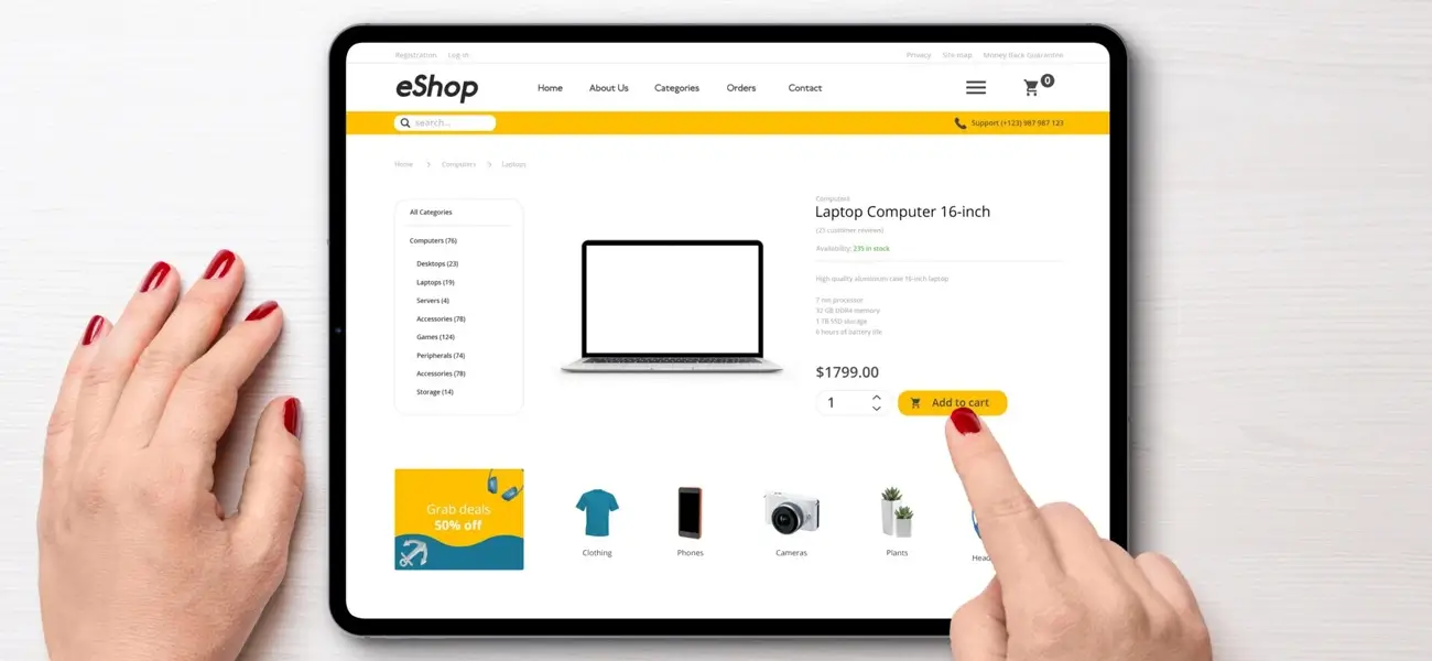
Tip 4) Integrate a button for viewing the cart
To pull off a large number of sales through your eCommerce store, you need to place the cart icon strategically. Position the icon near the product price or at a suitable page location so that it is visible enough.
Even while browsing another product, upon clicking the cart button buyer can view all the previous orders placed. This constant visibility of the cart icon significantly improves the lead conversion rate. Ensure the icon can be recognized easily, such as a shopping cart or bag.
Given the importance of this button, its color must be adequately bright to stand out from the backdrop. It must also be larger than other buttons and icons for customers' ease of finding.
-
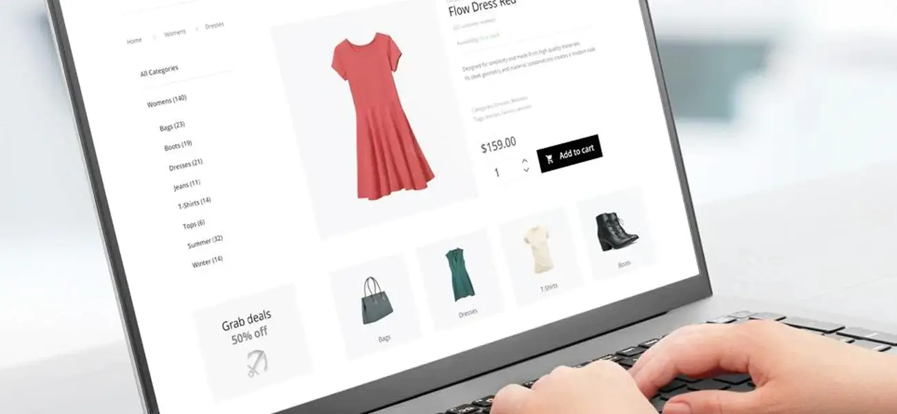
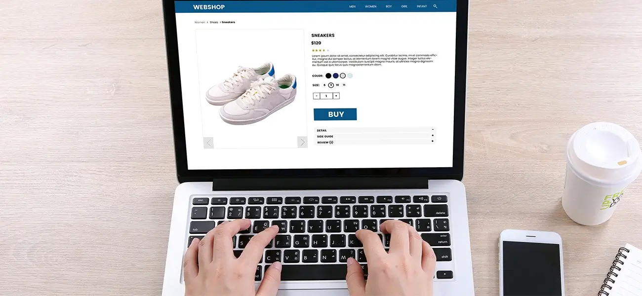
Tip 5) Always include high-resolution and clear product images
Online shoppers place orders by viewing product images and mentally visualizing the dimensions. Unlike a flea market, the product is not on the counter for display or physical scrutiny. This makes it compulsory for brands to display detailed product images on their site. The images must also have demo videos or 360° images for better viewing and ease of understanding.
Poor-quality images appear blurred or pixelated. This highly damages any brand and makes buyers perceive it as unprofessional. Ensure the site has a dedicated image gallery of individual products showcasing vital product details. Make sure the images show the products from multi-angles.
Nowadays, the pop-up box feature is quite popular as visitors can zoom in on any product image to check finer details. The process resembles checking out a product physically. So remember to integrate this feature also in your eCommerce site. Usually, brands hire professional photo editing companies to edit their product photos.
People tend to be influenced more if they see real-life models wearing clothes rather than mannequins. So, image editing techniques play a major role in eCommerce industry business. Having ghost mannequin images is a must-have for apparel stores. Video demos are also useful for selling products involving complex functioning.
-
Tip 6) Remove distracting elements from the web page
Your eCommerce site is an online venue for making optimum sales. Include a blog wherein relevant posts related to usability or functioning of products’ being sold can be published. Include an optional feature that enables visitors to receive periodic email newsletter highlighting:
- New additions
- Upcoming & ongoing launches
- Sales & discounts
- Promotions
- Brand stories
- etc.
However, ensure the additional resources are relevant to your store’s theme. They must also be useful and add value to visitors’ pursuits. Anything immaterial or meaningless would be interpreted as belittling sentiments of visitors. This tends to distract them permanently.
Also, the position of additional resources should be strategic. You can integrate a form for signing up your email newsletter at page’s bottom or in Contact Us form.
But, if the same pop up at unwanted times and blocks the screen, it would be considered by visitors that you don’t respect their sentiments. The annoyed buyers may not continue with the shopping even if they may have populated the cart with desirables. Also, they would be less likely to share their emails with you.
-
Tip 7) Provide Space for customer feedback and reviews
Majority of online shoppers check customer feedback before moving on with a brand. This implies that if your site does not contain product testimonials, customer reviews, feedback, audience polls etc., you are more likely to shorten the time spent by visitors. This translates into lesser conversions and dwindling sales.
You can make your e-strategy more robust by including product focused reviews. They would appear underneath the description of each product. If the number of products marketed by your site is less, you can have a dedicated testimonial page containing useful, unedited reviews.
-
Tip 8) Categorize Your Products for ease of searching
It is important that the site visitors can easily search for the desired products. To ease this process, products must be neatly organized into relevant categories. The search box integrated into the site’s menu bar must allow the discovery of looked-for categories with the right keywords.
This is valuable as visitors can get an overview of other products they didn’t know existed on your site. As a result, more sales will be triggered at no additional promotional expense. If you are new to eCommerce, you can visit major sites like Flipkart, Amazon etc., to understand how product categorization works.
Their menu bar’s dropdown usually carries various enlisted categories they sell. These include:
- Mobiles
- Electronic gadgets
- Clothing
- Jewelries
- Beauty products
- Home care products
- and more. Upon clicking a category, the search for a specific product can be narrowed down as relevant brands and product types appear.
-
Tip 9) Improve search functionality with product filters
Your e-commerce business can further flourish if you provide filters in your site’s search functionality to render it more usable. Suppose a visitor has found what he had been looking for on your site just to realize the stocks have run out. How can you avoid this frustration? Having filters can help visitors narrow the search to the maximum extent possible.
So, if your site had a filter indicating whether stocks exist, visitors' time would not have been wasted. Filters can be of different sizes. For the smartphone category, for example, you can have filters for:
- Screen size
- RAM
- Internal storage
- Expandable memory
- Processor speed
- In/out of stock
- Price range
- Launch date
- etc. This streamlines the navigation process for visitors and makes the search very specific.
-
Tip 10) Simplify the checkout process
The shopping enthusiasm of even the most loyal buyer may fizzle out if the checkout process is complex. Research shows that buyers often abandon the shopping cart because they have to negotiate a time consuming and complicated process.
Your site must permit guest checkouts. Buyers who are not willing to share too much information about them can then shop confidently. Most people feel disgusted at the prospect of having to fill a lengthy registration form before they can place orders. Some people also grow suspicious about your intent when greeted with too many fields in the registration section. In a competitive market space, you cannot afford to lose even a single buyer.
Seek only from buyers the information that is needed to seamlessly process the order. This includes name, shipment address, payment mode etc. If a digital service is being provided, you need not collect even this information as you need not ship the product anywhere.
Despite implementing these measures, if the cart abandonment rate does not drop, don’t get discouraged. This may be because first-time visitors are often hesitant to seal the deal. You may launch a campaign targeting these prospects to make them revisit your site for completing the pending purchase.
-
Tip 11) Optimize your e-commerce site for viewing on handheld devices
Due to the unparalleled penetration of mobile devices among masses, most prospects would browse your site from handheld devices. With technological advancement in mobile devices and their falling prices, it is highly likely that mobile browsing rate would increase in the future. This makes it imperative to get your e-commerce site optimized for streamlined mobile usage.
You need to embrace a responsive web layout for your site so that the e-commerce pages would adjust themselves intuitively to the dimensions of the viewers’ screens. Whatever be the operating system i.e. iOS, Android, Symbian etc. the end result would be device optimized. You need not pay the web development agencies extra money for creating separate versions of your eCommerce site for different devices. You only need to ensure that the images are optimized for clear viewing across devices and form fields are compatible with various platforms. While testing the site, check the ease with which undistorted pages open and get browsed on various devices with different sizes and operating systems.
-
Tip 12) Use text in a moderate amount
Product descriptions should be concise, accurate, informative, actionable, meaningful and optimized for screen size. Too much text would only distract leads. Trash or fluffy content would prove fatal. Use only relevant content in that many words as would serve your purpose.


Conclusion
Having a holistic e-commerce site with all design elements perfectly aligned with your brand’s image can be a demanding task. This post must have raised your awareness level about the ingredients of a crazily converting site. If you feel constrained by the lack of resources, don’t worry, check our web design do's and dont's article. MAPSystems is here to help you out.
Acknowledged as the leading web developing company, experts at MAPSystems would give the much-needed makeover and facelift to your e-commerce website.