Magazines are a source that entertain the masses with various information they pour on the readers. A good magazine is a collection of information and some key elements of the magazine layout that make it shine in the eyes of the readers.
In this article, we have collected a few important tips for creating inspiring magazines that will leave the readers awe-inspired with the content and layout design.
But before that, let us discuss the principles of magazine design on which the whole anatomy of a magazine layout depends.
Principles of the Magazine Design
While discussing the parts of magazine, it is crucial to discuss the principles on which the whole anatomy depends. Following are a few things one must consider while planning for a magazine layout-
-
Purpose of the Magazine
Before you choose a layout, first, you need to understand the purpose of creating a magazine, why it is created and what is the target audience for which it is created, whether it is going to be an image-based magazine or a story-based one, is it a documentation type or a funny one.
You need to first set the plan, and accordingly, you need to design the layout that will serve the purpose of its creation.
-
Content Balance
It is crucial to properly place the content to strike a fine balance. For this, the publisher needs to evenly distribute the page as per the content to avoid cluttering and leaving the widows and orphans.
Content balance is required because if the content is improper, it may irk the reader and result in a loss of interest.
-
Hierarchy
When you frame a content, it is important to form a proper hierarchy to stand out and create unparalleled and untouched content in terms of quality.
The hierarchy should be so that the most important part comes in priority, and the least important part can be covered in the last pages of your magazine.
-
Readability
This is one of the major magazine design ideas of all time. One of the thumb rules of writing is that your readability should match the level of your audience’s intelligence, and for that, you must write in a way that is easy to read and understand.
Always watch the font and point size you are using while placing the content in the given space. Also, choice of color scheme is extremely significant as it may impact the content readability knowingly or unknowingly.
Typography in Magazine Editorial Design
Typography is a pivotal part of magazine layout design, as it is an essential section of the editorial design. When you design an article or frame a write-up, it is important to understand the use, why and how it should be shaped to make it ready for an editorial design.
Here are some elements within the typography that will help you understand the layout design.
-
Point Size
When you are planning to publish reading material in a magazine, make sure to choose the size of the font or text that is readable, just by looking at the page or a screen in the case of an online magazine.
-
Balance the Length of the Copy
Most of the time, a minute thing that is left unnoticed is balancing the length of the copy. Breaking the big blocks or paragraphs that may bother the readers, is indeed a good practice. Always remember that the crisper and shorter the content will be, the more it will be readable.
Always use small paragraphs, lists, relevant bullets, threaded text frames, columns, etc.
-
The Length of the Characters
As per the writing rules and the magazine layout designs, one line contains a character limit of 50-70 characters. Hence, it is important to understand the length of the characters in each line to lessen the possibility of keeping the readers at bay.
-
Entry Points
When a write-up is written, it should be well presented using drop caps and other visually appealing blocks in unique colors to highlight the important section.
Now that we have a fair idea about various magazine sections and how to portray your content to make it look visually appealing and readable, it is time to understand the ideas to improve magazine layout design.
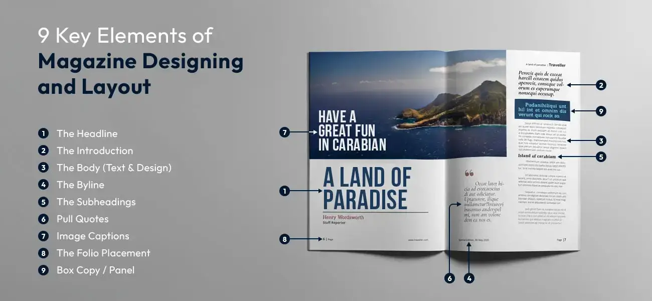
9 Key Elements of Magazine Designing & Layout
As discussed in this article, several magazine design layouts are required while publishing content and placing the elements in a magazine to make it look attractive. Still, the below-shared elements are the most crucial ones to develop creative magazine designs.
We will discuss these elements in a hierarchy-
-
The Headline
On one hand, where headlines should be catchy and crisp enough to draw the attention of the readers, on the other hand, it has to be big and bold so that it is highlighted as a ‘Gist’ of your content.
A headline should be set in a bigger size than the text on the page, and this is how it can get some eyes on the topic.
-
The Introduction
The introduction is highly significant as it is considered an essential piece of your whole write-up. It gives the through and through information of what your content is about. This is the reason why it should be engaging and captivating in the sense that it awakes the urge to read the whole content.
An introduction builds the readers' connection with the content you have displayed in a magazine.
-
The Body (Text & Design)
For creating a body of content, you need to understand the psychology of the consumers, and only then a hard-hitting body text should be written. It should be engaging because it is lengthy and is the most part of the whole content, and it should keep the reader hooked right to the end.
Apart from the content part, the design part of the body text should also be aligned, the main points should be highlighted properly, and there should be an ideal length of all the write-ups in a magazine to do justice to all types of article topics.
-
The Byline
When you present an article, and it is a well-written one that pours a lot of information, the readers might be curious to know who wrote such a write-up. This is why it is important to acknowledge the person or the team who worked to make it successful.
As per the pattern of the articles, the author’s name is mentioned right below the headline, also called a byline. It is usually written in the same font and size as the body text.
-
The Subheadings
If you are familiar with the writing style of the content, you might have encountered the process of using subheadings. This is the best way to make sections of the article to give it a good readability score.
The subheading, if written for offline purposes, can be written in the same font size, whereas, if it is written for online purposes, there is a proper pattern that should be followed to make it reach page one of the Google ranking.
-
Pull Quotes
If you want to make your article an engaging piece of content, it must have pull quotes that are relevant to the topic. They are used in the write-ups as they provide a different dimension to the content by making it more intellectual and interactive and sometimes, relatable to a reader’s life.
-
Image Captions
Image captions are important in both online and offline based magazine articles. It should be written in a way that complements the whole article, as well as makes the image says a lot about itself.
The image caption's font can either be the same font size as the body text or be slightly small, but readable.
-
The Folio Placement
This is the placement of the pages in a magazine in such a way that doesn’t annoy the readers. Folding the pages in a manner that does not distract the readers, even if all the images are full of images.
-
Box Copy / Panel
You might have encountered certain important facts in pop-up boxes that give a kick to the content by highlighting some pointers you must know as a reader about that topic.
These facts can be related to some study or stats or maybe some historical fact. These are written in a small word count to give a glimpse of the information, best for the readers who want to take a glance at the topic and then decide whether to read the full article or not.
These were some of the most important elements while framing a magazine layout design. A magazine design or layout is not easy, and it requires some expert hands to get the job done. By expert hands, we mean professional magazine layout design services companies, and a experienced freelancer designers who genuinely knows what makes a great magazine design
Hope this article has been able to explain all the critical elements of magazine design. As a recap, the main elements for a head-turning magazine layout are the headlines, images, subheadings, body copy, cover design, as well as featured advertisements. When all these pivotal components are synced together in the right balance, it results in a cohesive and coherent magazine spread.
So keep practicing and honing your skills with diligence. Soon, you can master the art of creating visually captivating magazine layouts.
Frequently Asked Questions
Magazines typically have 30 to 160 pages, depending on content, frequency, and audience. Weekly magazines are shorter, while monthly or industry-specific ones can exceed 200 pages. The page count includes articles, interviews, advertisements, and visual elements, ensuring a balance between engaging content and commercial aspects to attract and retain readers.
The cover grabs attention and influences purchasing decisions. It highlights key stories, sets the tone, and differentiates the magazine from competitors. A strong cover with striking visuals, bold typography, and compelling headlines boosts sales and branding. It creates a lasting impression, making the magazine stand out on newsstands and online platforms.
The table of contents guides readers, listing articles and sections with page numbers. It offers a quick overview, making content easily accessible. This section enhances navigation, helping readers locate specific topics efficiently. It is instrumental in magazines with diverse content, ensuring a seamless reading experience without unnecessary page flipping.
Feature articles provide in-depth insights on trending or significant topics. They offer well-researched content, storytelling, and expert opinions, making the magazine informative and engaging. These articles help establish credibility, cater to reader interests, and add value, whether through interviews, investigative reports, or industry trends, enhancing the overall magazine experience.
Virtual reality (VR) is revolutionizing architectural visualization by offering immersive, interactive experiences. Clients can explore unbuilt spaces in real scale, enhancing understanding and feedback. As VR technology becomes more accessible and integrated into design processes, it’s increasingly seen as a vital tool for presenting and refining architectural concepts effectively.