If you are a designer dealing with magazine covers, you would be on the hunt for creative magazine layout designs to deal with the covers. It is a challenge for all, and at the same time, you need to manage the high volume of content in the magazine. The magazine covers crave for a stylish look as well as information. The target audience should be able to make out about the contents by looking at the cover. Here are five innovative ways in which you can accomplish premium quality magazine cover design. Whether you design for web, or print design, these tried and tested ideas will surely come in handy.
-
Texts around images
![magazine layout design ideas]()
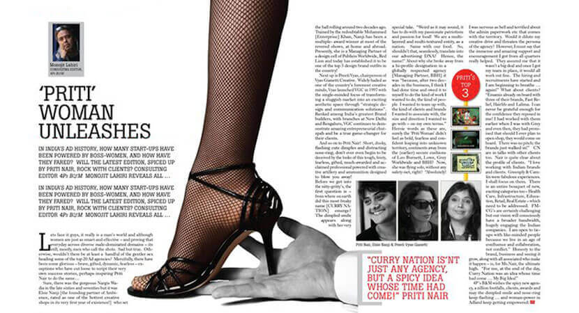
The magazine covers have to be attractive as well as informative. Hence, you need to wrap texts around images with new concepts. Traditionally, designers offering magazine design services lack experimentation while dealing with the layout design. They are limited to the square frame of the cover with either texts or images. The interplay of both these elements makes the cover perfect. This makes the presentation free flowing and you need not confine the design to the grid-like theme. A unified look is achieved when you integrate photography with texts.
Well, to incorporate this theme, you should look out for photos with substantial amounts of white space. The ones with strong and simple outlines are ideal for the design, rather than detailed and complex ones.
-
Go for aerial shots

Aerial shots give a bird's eye view to the images on the covers. These can be used as captivating themes to attract the attention of the readers. Particularly, food and drink magazines incorporate this theme to make the images visible from the top. Aerial shots are especially best for travel magazines, photo journals, animal life photography, etc. You need to change the angle of the photos drastically to make the stuff interesting to the public. Aerial shots are in vogue for quite some time. They are absorbing and effective.
It allows seamless merging of the photography with the typography. You can use unusual chunks of words and other texts in the form of headers to fill up the gaps in between. It will create a creative and eclectic design.
-
Go three dimensional (3D)
You can incorporate a 3-dimensional look on a two-dimensional layout by crafting multiple layers of images and texts. You can rely on your innovations when you make the 3D designs. You can cut a particular photo away from its background, placing it in a different layer for 3D magazine layouts. This will make it look three-dimensional, as if it is jumping out of the cover. In reality, it is easier than what people think it to be. The layers look more energetic and vibrant when you make them look 3D.
-
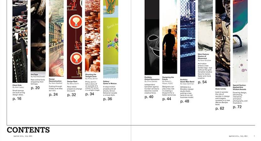
Deliver a makeover to your contents page
Although the cover page lures the readers to give a quick glance through the book, the content page compels them to buy it. Evidently, the contents page calls for special treatment. It anchors the entire publication. Before the readers move along to the articles and features, they go through the contents page. You need to exercise a fair bit of creativity while designing a magazine layout of the contents page. Try to avoid a long and dull list in the contents page. Instead, incorporate vibrant colors and typography to make the page livelier. Professional magazine design service agencies are ideal for such artistic approach. They have skilled graphic designers with a sharp eye towards perfect color palettes that enhances a design.
Although it is a time-consuming process, you will not repent in doing something that will make you magazine sellable.
-
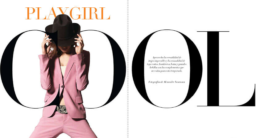
Use big fonts
While designing the opening spread of a feature inside the magazine, you need to incorporate big fonts to create the visual appeal. This makes the page stand apart from the others, calling out to the reader to go through the page. Pair up bold typography with dynamic photography to make them attractive. It will set the mood for the entire feature. Be choosy with the font when you craft this particular element. This is also a crucial one among several other InDesign magazine layout tips. Sans Serif, for instance, is a big, playful and appealing font that goes well in these cases.

Conclusion
The theme of the typography should revolve around the subject of the contents. Make it loud, bold or brash, as it efficiently merges with the central theme of the stories. It is a tested way to engage the readers.
High quality graphic design trends is imperative in magazine crafting as nothing else works without it. Discover ever more fresh ideas and improve your digital magazine designs. Several stylish templates are available online that are free to use and get inspired. Check those out for your design inspiration and use them for creating amazing magazine designs. You can also get in touch with inventive professionals who can sense the pulse of your audience and show justice to the magazine genre.