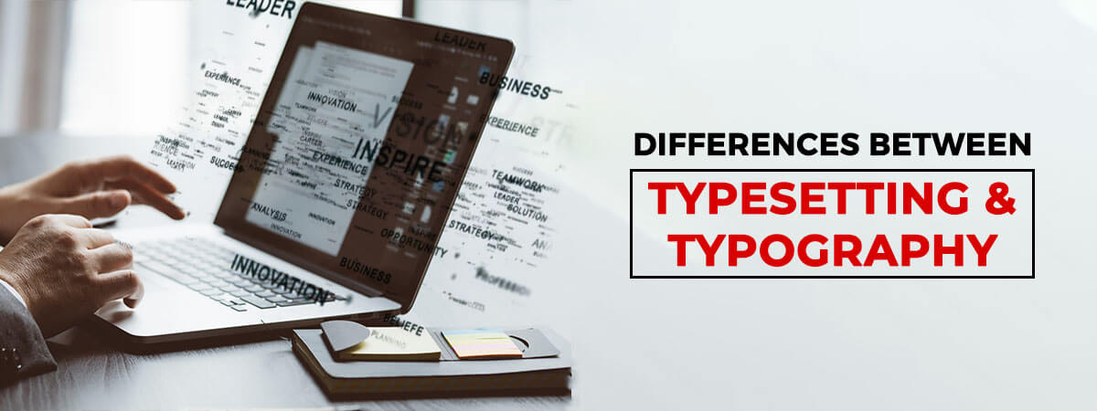
Typesetting vs. typography is a common and hot topic of debate for those in the printing and publishing industry. Many believe that both are the same thing, just called by different names, while the others think that there is a very thin line between them, but they are different.
Well! No offense to those who believe that they are the same! The reality is that they both are VERY different from each other and have different sets of rules.
Not convinced?
Not a problem, in this blog, we will clear this myth once and for all for you, but before that, it is very important to dig deep and understand both the processes from scratch and then the major difference will be revealed.
So keep scrolling!
What is Typesetting?
If explained most shortly:
Typesetting is a ‘process’ of arranging or composing a text to make it ready for printing
or publishing.
In the longer sense, typesetting is the ‘process’ of touch pointing or covering various sections in a step by step manner like deciding the text, how a word should look like, sentence formation, and ultimately forming a presentable paragraph and easy to read.
This process follows the rules while making it ready for publishing or printing. Also, some parameters are considered keeping the reader’s perspective in mind. The parameters are choosing the font look and apt size, font color, alignment of the text as per the flow, and the presentation style of the whole text.
Three Fundamentals of Typesetting
The typesetting process includes 3 fundamental techniques to set the text, including
- Kerning: This is when the spacing adjustment is made between the letters or the individual characters to make the text feel evenly distributed.
- Tracking: Often confused with Kerning, this is creating space between words to ensure they’re not too close together and give proper visibility to read.
- Leading: This is the process of spacing between the multiple lines of text in the vertical direction. To measure the leading stars from the baseline of each line of text.
The ascenders and descenders are also kept in mind while following the process of leading to maintain a proper flow of letters.
What are the Benefits of Typesetting?
Today, many publishing and printing-related businesses use the most advanced tools and technology to get the typesetting done for their content to make it look presentable for the readers.
Professional typesetting companies are the major players, providing 360-degree support with advanced technology and procedures.
These businesses are still using this process because it has many benefits, and by the time it has been upgraded to suit all the publishing-related needs.
Talking about the benefits of typesetting, listed below
- Aligned Content Improves the Readability Experience
- Right Font Choices Suit to Eyes & Influences Reading
- Proper Indexing Helps in Finding Text Quickly
The Major Typesetting Errors to Avoid By Prepress Services
- Improper Contrast can Make the Content Look Dull
- Too Tight or Too Loose Spacing
- Wrong Structure with No Details like Page Number, Footnote, etc
- Use of Low Quality or Resolution of Images.
Yes, typesetting is a huge topic, and we’ve covered the most important pointers for you. Now let’s move on to the next section, i.e. Typography.
What is Typography?
If explained most shortly:
Typography is an ‘art’ or a ‘technique’ of placing and decorating letters in such a way
to make them visually appealing to the readers.
In other words, this technique is more related to the designing elements and focuses on letters and words and beautifying them with the use of tools like word art and choosing the best font style.
The typography experts also use calligraphy and designer fonts to enhance the beauty of the content.
The Major Elements of Typography
-
Typefaces & Fonts
Font and Typeface are believed to be similar, but practically both are different from each other. The font is a mix of style and size for a particular text, whereas typeface has a larger meaning, and it is a family of various fonts, including multiple sizes and styles.
-
Hierarchy
A typographical order is majorly a sequence of how your content should look. E.g., the headings should be bold and big while the subheadings should be comparatively small, and the body of the content should fall in third place in terms of size.
Other than this, the color, contrast and alignment are also inclusive.
-
Contrast
Talking about the visual impact, difference plays a major role. Using this, you can highlight the areas you want your readers to look at and also help in breaking the text on a particular page.
-
Consistency
To avoid cluttering and messy content, consistency is the key. Always try to follow a particular font for headers and some other for the subheadings to make them look distinguished from each other.
-
White Spaces
One more element to maintain hierarchy in your content is the use of White Space or Negative Space. That is a white space. You must have seen some white areas left in the printed books and around some graphical representations.
No matter how unnoticeable it is, it is very important to add your content to make it look streamlined.
After all this knowledge sharing, it’s time to discuss the major topic
Difference Between Typesetting and Typography
As we understand the basic difference between both typesetting and typography, now we should move on to get a piece of knowledge on this topic to enhance our understanding.
Let us quote some pointers to give a clear idea about the topic-
Typesetting
- A language rule is followed to set the text and the way it is presented
- A pre-designed font is used, and in case there is a need for a new font, another set of rules follows it
- Text formatting must be in proper alignment leaving proper spacing
- Static nature and does not allow to experiment with new font styles
Typography
- Creative liberty to make the content look appealing
- Designer fonts and calligraphy is used to enhance the look and feel
- The prime focus is to make the content look attractive to the readers
- Customized fonts and the use of kinetic typography for motion
Conclusion
Understanding these differences allows designers and publishers to apply both techniques effectively, creating content that is not only visually stunning but also functional and readable. By mastering both, you can elevate your content’s impact and make it more engaging for your audience.
The professional typesetting service providers follow all the commands and typesetting rules to give the most refined output to their clients, considering the brief given. The prime focus is on how the final output looks and how appealing and presentable the content is for the readers. Also check on the journey of typesetting till date