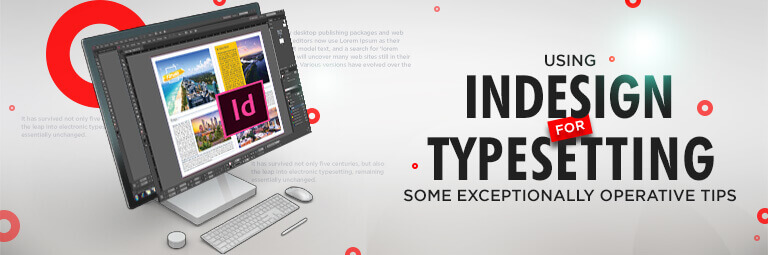
If you have ever flipped through a beautifully designed magazine or a perfectly formatted book and wondered how everything feels so balanced and polished, the secret lies in the art of typesetting. Adobe InDesign is the industry-standard software that gives designers, publishers, and authors full creative control over text and layout.
Whether you are working on a novel, brochure, or digital publication, understanding how to arrange text with precision is key. In this guide, we shall explore the process, tools, and best practices to help you master typesetting in Adobe InDesign like a pro.
What is Typesetting?
Typesetting is the art and technique of arranging type to make written language legible, readable, and visually appealing on a page. It involves selecting the right fonts, adjusting spacing, aligning text, and creating a coherent structure that guides the reader's eye effortlessly through the content. While traditionally done manually, today's digital world offers powerful typesetting software like InDesign to streamline the process.
Effective typesetting enhances readability, reinforces branding, and can even influence the emotional response of your readers. It's both a technical and creative skill that lies at the heart of any quality publication.
Why Use Adobe InDesign for Typesetting?
InDesign stands out among design tools for its exceptional typesetting capabilities. Whether you're designing marketing material or handling typesetting for books, it offers a suite of powerful features to manage complex text layouts with ease.
Adobe InDesign is preferred by professionals because it allows users to fine-tune every aspect of text appearance—fonts, spacing, alignment, and flow—while supporting high-end prepress and publishing workflows.
The integration with other Adobe tools, support for large projects, and the ability to export print-ready files make it the gold standard for desktop publishing. Compared to other tools, InDesign typesetting provides far more flexibility and control.
-
Advanced Typography Tools
One of InDesign’s biggest strengths lies in its advanced typography tools. You can access OpenType features, glyphs, ligatures, and language-specific typographic controls. It supports nested styles, GREP styles, and character-level formatting, allowing deep customization.
Features like drop caps, bullet lists, and multi-level numbering help in creating polished documents. In long-form content like novels or academic journals, this becomes crucial. InDesign's tools let you standardize formats and maintain consistency across hundreds of pages—something that sets professional layouts apart from amateur ones.
-
Precision Layout Control
Precision matters in typesetting. Even a slight misalignment can disrupt the visual harmony of a page. InDesign offers pixel-level control over margins, indents, columns, gutters, and more. With customizable grids and guides, users can align content perfectly across pages.
These tools are essential in ensuring that elements line up exactly as intended. Whether you're working on textbooks, catalogues, or marketing collateral, typesetting in InDesign allows for meticulous placement of every typographic and visual element.
-
Interactive and Print Layouts
A unique feature of Adobe InDesign is its support for both print and digital publications. You can add hyperlinks, interactive forms, buttons, animations, and embedded media for digital content, while maintaining high-quality output for printed versions.
This dual functionality gives creators a huge advantage. Want to publish an eBook and a printed copy simultaneously? InDesign has you covered. Whether you’re creating an interactive magazine or a print-ready novel, typesetting in InDesign offers unmatched versatility.
-
Efficiency
From automating page numbers to managing multi-chapter books, InDesign is designed for efficient workflows. Master pages, libraries, and style sheets drastically reduce repetitive tasks. The ability to create templates saves hours of work, especially for large documents.
This efficiency is particularly helpful for prepress services that handle bulk publishing jobs. By streamlining the production process, InDesign ensures quality doesn’t come at the cost of time. Its non-destructive editing and live-preview capabilities make revision cycles faster and smoother.
Getting Started with Typesetting in InDesign
-
Choose the Right Document Size
Start by selecting the correct dimensions for your project. Whether it’s A4 for a report or 6”x9” for a book, choosing the right size ensures that your content fits perfectly within the printable area. You can also set bleed and slug settings for print-specific requirements.
-
Set Up Styles
Create paragraph and character styles early on. Styles allow you to maintain a uniform look across all text. Adjusting styles later will update all linked content instantly, making formatting a breeze.
Adding Text and Working with Frames
-
Create Text Frames
Text in InDesign lives inside text frames. Draw them manually or use templates to place text precisely where you want. Text frames can be resized, linked, and aligned to grids or guides for maximum precision.
-
Threading Text
Threading lets your text flow across multiple frames. This is especially useful for multi-page layouts like magazines or books. You can automatically add pages when text overflows, a key function in typesetting for books.
Controlling Typography and Layout
-
Font Selection
Choose fonts that match the tone and purpose of your content. Serif fonts are great for traditional books, while sans-serif suits modern designs. Always ensure legibility and consistency.
-
Leading and Tracking
Leading controls the vertical space between lines, while tracking adjusts spacing across entire words or phrases. Proper use of these features ensures the text is neither cramped nor overly loose.
-
Kerning and Spacing
Kerning adjusts the space between specific character pairs. This fine-tuning enhances the overall visual appeal and avoids awkward gaps or overlaps, which are among the mistakes to avoid in typesetting.
Advanced Typesetting Tips in Adobe InDesign
-
Optical Kerning and Metrics Kerning
Use “Optical Kerning” to let InDesign adjust spacing based on character shapes, especially useful when working with decorative or custom fonts. "Metrics Kerning" uses font-defined spacing. Choose based on what suits your layout better.
-
Use of Grids for Consistency
Baseline grids align text across columns and pages. Using grids helps maintain vertical rhythm, an essential component of professional typesetting rules for authors who want to avoid inconsistencies.
-
Managing Text Flow with Styles and Paragraph Settings
Use Next Style, Keep Options, and Widow/Orphan controls to manage long documents. This helps in handling structured content like chapters and sections with automated formatting.
-
Paragraph and Text Alignment
Use full justification or left alignment depending on the genre. Avoid center-aligning body text. Balance ragged edges and keep hyphenation rules in check to maintain readability and aesthetics.
Common Typesetting Issues in InDesign and How to Fix Them
-
Rivers in Justified Text
Rivers are awkward white spaces running down the page due to bad spacing. Fix this using hyphenation settings, tighter tracking, or changing justification settings.
-
Overuse of Fonts
Stick to a maximum of two or three fonts in one document. Overusing fonts creates visual chaos and distracts the reader, weakening your message and branding.
-
Improper Leading
Too little or too much space between lines affects legibility. Follow the 120% rule—leading should be roughly 120% of font size—and tweak as needed to enhance readability.
Conclusion
Mastering typesetting in Adobe InDesign is a valuable skill that elevates your design projects to a professional level. With precise control, advanced typography tools, and efficient workflows, InDesign empowers users to create clean, beautiful, and functional layouts.
Whether you are a graphic designer, author, or working in prepress services, understanding these techniques gives your content the clarity and polish it deserves. By applying the tips and avoiding common pitfalls, you shall be well on your way to producing high-quality print or digital materials that truly stand out. Good typesetting isn't just about looks—it's about communication, structure, and impact.
Frequently Asked Questions
Adobe InDesign is a professional desktop publishing software used for designing layouts for print and digital media. You can use it to create brochures, magazines, books, and more. Start by setting up a document, importing text and images, using grids, styles, and alignment tools to create polished, organized designs.
InDesign type refers to the text elements formatted within Adobe InDesign. It includes font choices, paragraph styles, character styles, spacing, kerning, and alignment. Designers use InDesign’s robust typesetting tools to control every aspect of text appearance, ensuring consistency, readability, and visual harmony throughout documents like books, magazines, flyers, or brochures.
A good style in InDesign uses Paragraph and Character Styles to maintain consistency across your document. For example, setting headings, subheadings, and body text with predefined styles saves time and improves workflow. Clean, readable fonts, appropriate spacing, and clear hierarchy contribute to an effective and professional layout design style.
Without styles in InDesign, formatting becomes inconsistent and time-consuming. You’ll have to manually adjust fonts, sizes, and spacing for each text element, increasing the risk of errors. It also makes updating formats across the document difficult, leading to design inefficiencies, inconsistent branding, and a lack of visual cohesion.
You can find font examples in InDesign by exploring Adobe Fonts through the Creative Cloud. InDesign’s Type menu lets you preview available fonts. Additionally, platforms like Behance, Dribbble, or Pinterest showcase design projects with font details. These examples help inspire and guide your typographic choices in projects.