With the growing popularity of word processors, many technical authors are now handling their own typesetting. However, many of them are unfamiliar with the fundamental principles of typesetting, leading to common typesetting mistakes. These errors can significantly impact the readability, professionalism, and overall appeal of your document. Here are some of the most frequent typesetting mistakes to watch out for when typesetting your work, and how to avoid them.
Avoid These Common Typesetting Mistakes: A Guide for Authors
-
Failing to Clearly Present Author, Title, and Page Information
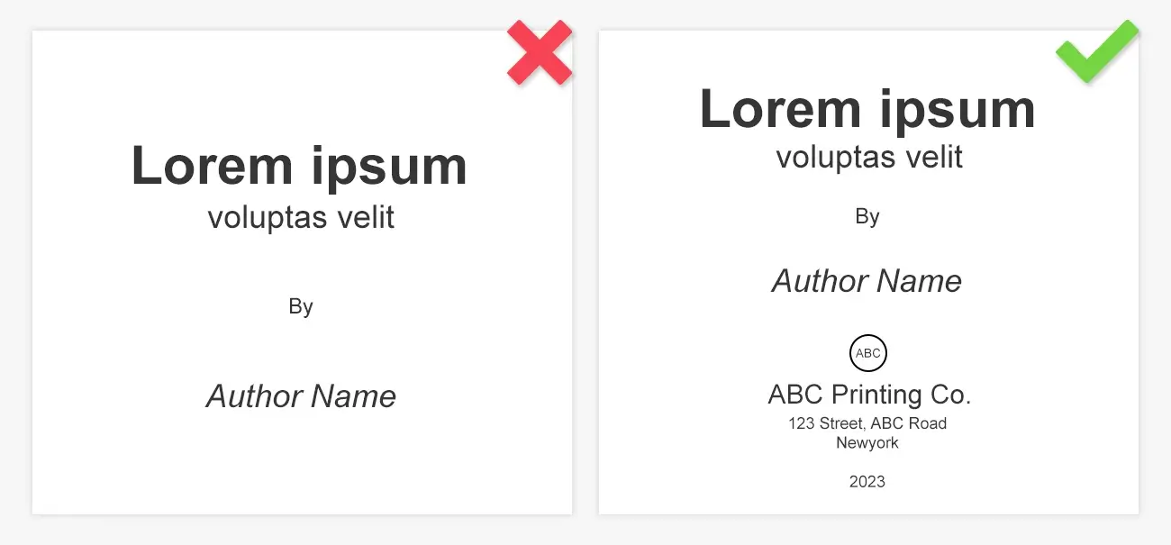
One of the most overlooked typesetting errors is failing to provide clear information about the author, title, and page numbers. Always include this vital information at the beginning of your manuscript. Ensure that the author’s name, book title, publication date, and version are all clearly visible on the first page. This practice helps with proper attribution, citation, and version control.
-
Ignoring Type Size for Readability
Choosing the right font size is essential for readability and overall appearance. Typically, a line length containing around 66 characters is considered optimal. Consider the needs of your target audience when selecting type size. For instance, if you're preparing content for an older audience or for those with visual impairments, you may need to opt for a larger font. Avoid overly tight or loose letter spacing, as it can disrupt the flow of reading.
-
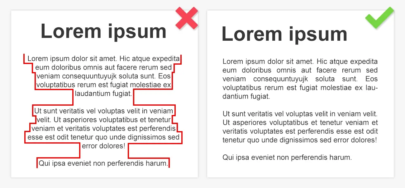
Overly Long Lines of Text
Another common typesetting issue is overly long lines of text. Lines that are too long can make reading uncomfortable, especially for digital formats. Aim to limit line length to 75 characters for a smoother reading experience. This helps prevent reader fatigue and encourages better comprehension.
-
Inappropriate Use of Monospace Fonts

Monospace fonts like Courier are often used for specific purposes, but they aren’t ideal for most professional typesetting projects. While they can evoke a typewriter-like feel, monospace fonts tend to hinder readability and make your document look outdated. Proportional fonts are generally a better choice for consistency and aesthetic appeal.
-
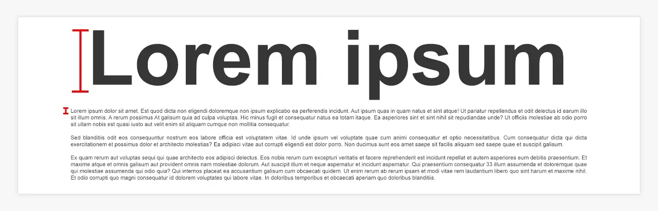
Making Headings Too Large
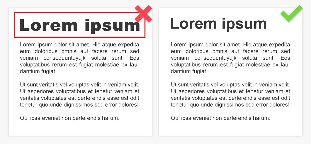
Headings are crucial for structuring your content, but overly large headings can be visually overwhelming. They should stand out from the body text, but not to the extent that they disrupt the balance of your layout. In most cases, using a slightly larger size or a different font for headings is enough to make them distinctive.
-
Misusing Formatting for Emphasis
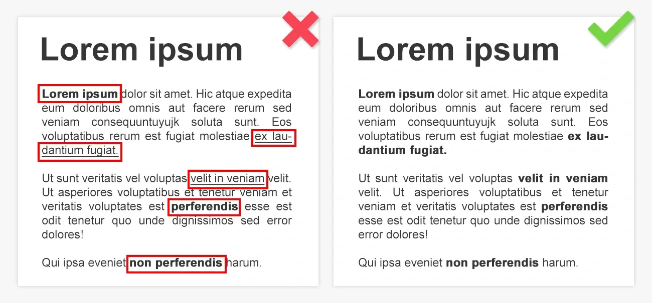
Inappropriate use of formatting for emphasis—like underlining or excessive bolding—can make a document look unprofessional. Avoid underlining, as it's a relic of typewriter-era formatting. Instead, use italics or bold text for emphasis, but don’t overdo it. Too much bolding or underlining can create visual clutter and reduce readability.
-
Lack of Control Over Line Breaks and Hyphenation
Failing to control line breaks and hyphenation can lead to awkward formatting and gaps in the text. Use non-breaking spaces and non-breaking hyphens to prevent awkward breaks, especially in compound modifiers or across page boundaries. Proper control over these aspects ensures a smoother flow for the reader.
-
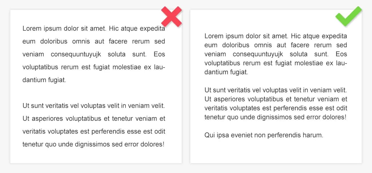
Failing to Clearly Distinguish Paragraphs
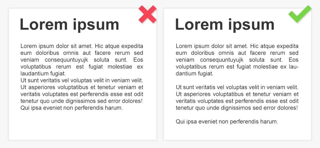
Making paragraphs clearly distinguishable is essential to the overall readability of your document. Use indentation or line spacing to separate paragraphs. This visual break helps readers follow the flow of your content without confusion.
-
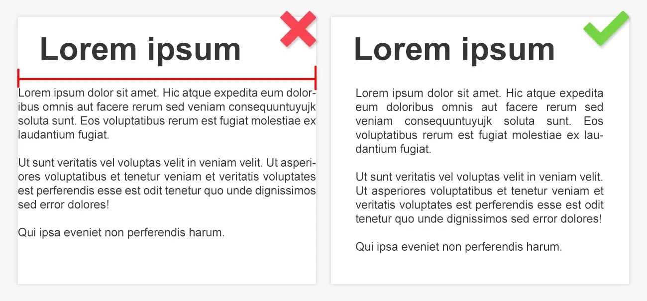
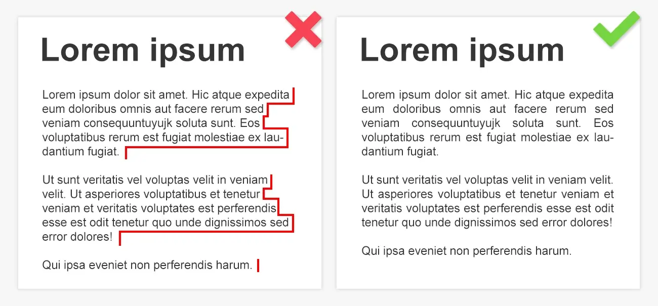
Inconsistent Alignment
Consistent text alignment is vital for a polished document. Avoid mixing alignment styles such as left, right, centered, or justified within the same piece. Most professional typesetting services will recommend justified text alignment, as it creates a clean, uniform look that’s easy to read. Be sure to also check the alignment of the last line of each paragraph.
-
Ignoring Hierarchy in Typography
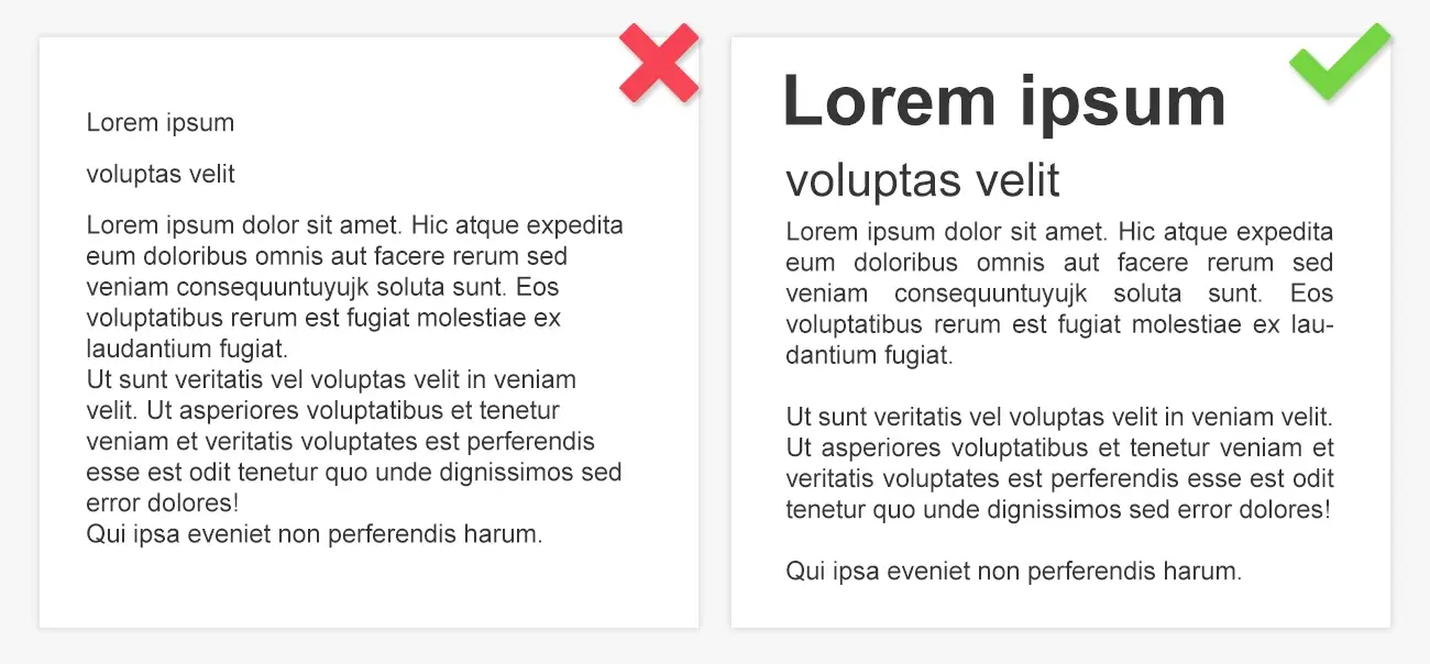
Typography hierarchy is essential to guide readers through the structure of your document. Without a clear hierarchy, readers may struggle to understand the order of importance of various sections. Ensure that the font size, weight, and style clearly distinguish headings, subheadings, and body text, helping readers navigate through your work with ease.
-
Using Double Spaces After Sentences
Double spacing after sentences is an outdated typographic error. The modern standard is to use a single space after a period. This practice not only follows contemporary typographic conventions but also reduces page count, which is particularly useful for long manuscripts.
-
Leaving Two Spaces After a Full Stop
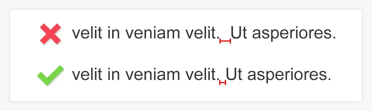
Another holdover from the typewriter era, leaving two spaces after a period is no longer considered acceptable in professional typesetting. Most modern word processors and publishing tools now handle spacing automatically, so avoid using double spaces after full stops to maintain consistency and modernity in your text.
-
Turning off guides and margins
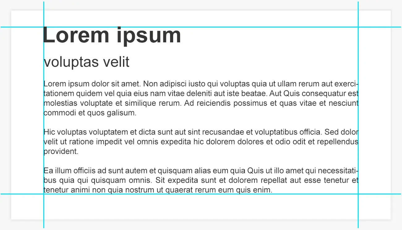
Guides and margins play an essential role in maintaining alignment and creating a clean layout. Margin settings help ensure that text doesn’t stray too far from the page’s edges, providing uniformity and a more professional appearance. Always keep guides and margins enabled in your typesetting software to maintain proper alignment and structure.
-
Misaligning Figures and Text
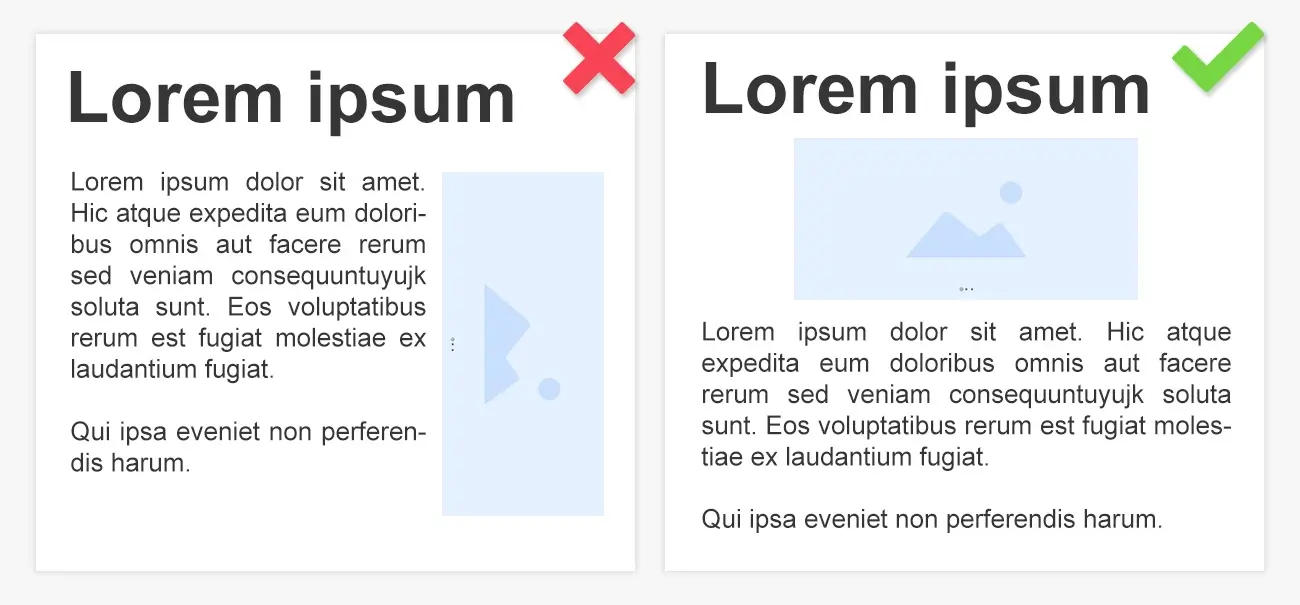
Figures and graphics should be aligned with the text to maintain visual cohesion. Misalignment can cause unnecessary distractions and make the document harder to read. Ensure that images, charts, or tables are placed consistently with the body text, contributing to an organized and professional layout.
-
Insufficient Contrast Between Text and Background
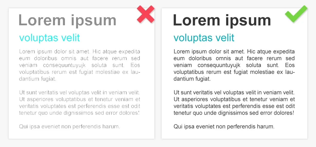
A fundamental yet often overlooked aspect of typesetting is contrast. The text must have sufficient contrast against the background to ensure readability. Whether you are using colored backgrounds or images, make sure the text stands out clearly. Poor contrast can cause strain on the reader’s eyes and reduce the effectiveness of your content.
Conclusion
Avoiding common typesetting mistakes is key to producing a professional and readable document. Whether you’re typesetting a technical manual, academic paper, or any other type of publication, following these guidelines will help improve the overall quality of your work. Typesetting errors can distract from your message and damage your reputation as an author. By adhering to typesetting rules for authors, you can create content that appeals to your audience and communicates your ideas clearly.
If you're interested in learning more, exploring the history of typesetting can provide valuable insights into how modern typesetting practices evolved. Additionally, for those looking to refine their skills, discovering tips to become an expert in typesetting can help you master the craft and produce high-quality documents. For authors seeking expert typesetting services, MAPSystems provides top-tier solutions to help avoid common typesetting mistakes and ensure your work adheres to global standards. If you have a project to discuss, get in touch with our team. Let us help you create a polished, professional manuscript that will impress your readers.