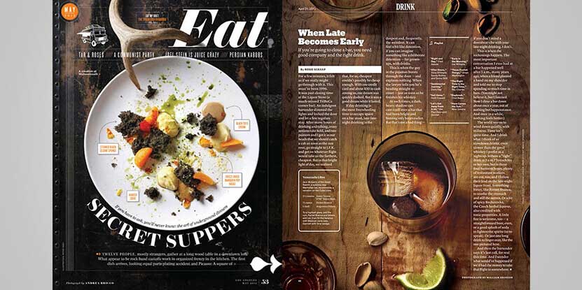
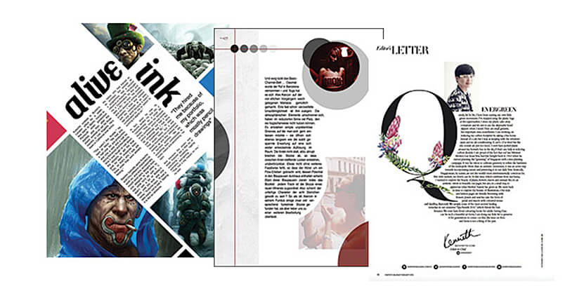
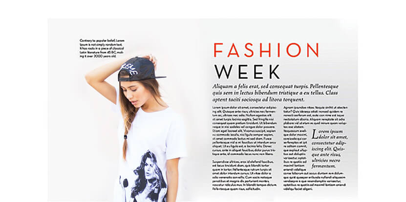
Designing the best magazine layout starts with the creation of a perfect balance between the images and the texts. Magazine designing services typically attach a lot of importance to layouts because layout is a critical design element, which determines the appeal of every magazine irrespective of its purpose or theme.
-
Document set up

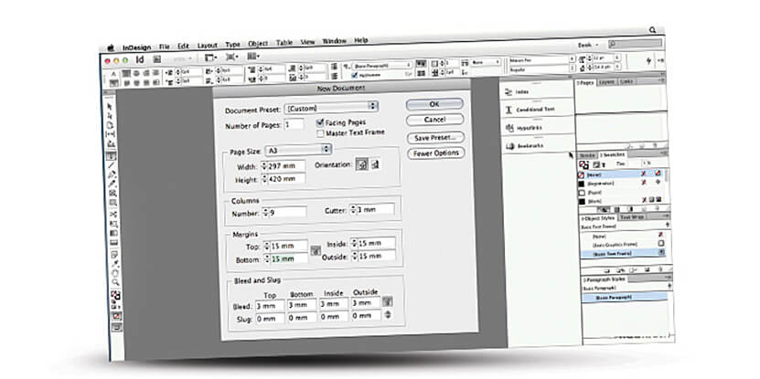
Consider standard document of normal A4 size. Let the number of pages be 10 and bleed be 3mm for assuring enough space. Now make the bottom and top margins 10 mm, outside margin 20 mm and inside margin 13 mm. (You can set up any measurements as per your preferences.)
-
Grid creation

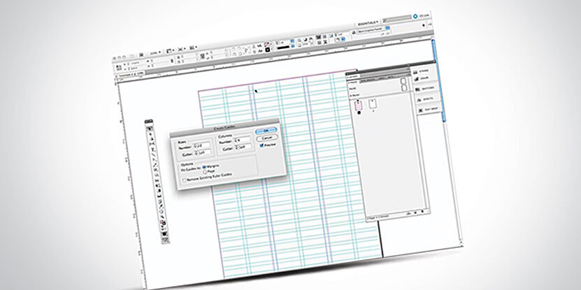
For setting up page grid, firstly go to "A-master spread" option and choose Create Guides from Layout. Grid avails uniformity to the page layout and an outline where content can be positioned. This is very vital for a professional magazine design layout.
-
Background placement

The most important thing to be taken care of is that a perfect balance has to be kept between the text, images and white spaces while creating a magazine design layout creation process. Using an image having enough empty space all-round the subject would be a good choice, especially for business magazine designing.
-
Body text creation

A text frame has to be created at the very same horizontal and vertical position as that of the combinationon other page. This helps in the creation of an imaginary line connecting the texts and images.
-
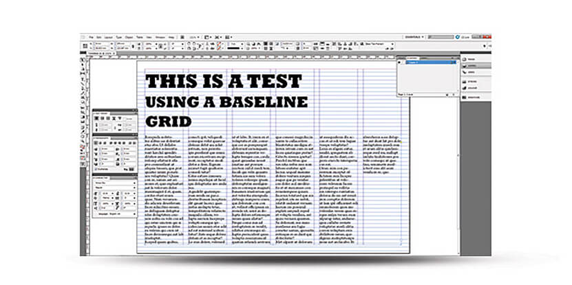
Baseline grid set up and basic paragraph style changing

For setting up the grid, go to ‘Preferences’, select ‘Grid’ and then set ‘Increment Every’ to half the measurement of leading. You can change the basic paragraph style by going to paragraph styles palette.
-
Hyphenation and justification

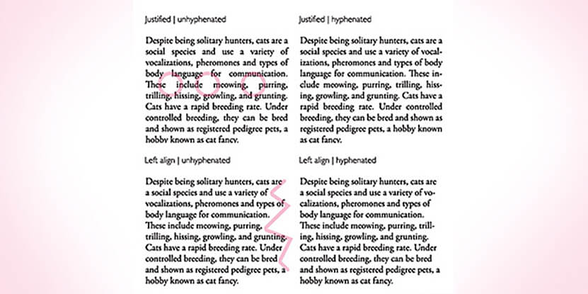
Hyphenation is crucial for correct texts; it breaks those long words towards the column ends for making sure that there are no large gaps but straight edge for the column. The hyphenation settings by default on InDesign needs little adjusting. The word spacing should be set to a maximum of 100% and minimum of 85%. You should set the letter spacing to a maximum of 2% and minimum of -2%.
-
Text colour and column

While magazine design layout, the text colour and column should be decided solely based on the comfort and readability it offers for your prospects.
-
Alignment setting
Go to the ‘Indents & Spacing’ section for setting to Left Justify. Align should be set to Grid setting for All Lines and enough space can be added after paragraphs. For separating the paragraphs, you can simply use the First Line Indent as well.
-
Heading

For heading, using a bigger text size and negative tracking value is advisable. Tracking adjustments can benefit headlines immensely. Also, finally set the optical margin alignment.
-
Adding page numbers
You can also add page numbers either manually by creating a text box with the name of the magazine and page number or automatically.
-
Preview you layout
There are 5 different previewing option available in InDesign.
- Normal
- Preview
- Bleed
- Slug
- Presentation
-
Export your final design
To export the print design, go to 'file' menu and select 'Export' option. You can also export your design in .INDD format and .PDF documents.
Conclusion
Most of the creative designing companies offering magazine crafting services, make sure to take care of the above factors. Designing magazine layouts can be really challenging as you need to manage a lot of content while making it look professional. There are a lot of creative designing companies offering graphic design services,can help you with this job.However, you need to invest a good amount to get high-quality designs. In case you have a bit of knowledge in graphic designing and looking for a cost-effective option, then it is best to make use of the above suggestions. These tips will surely ease up your work in developing an outstanding magazine layout designing or on how to create magazine or even act as a source of magazine layout inspiration to create your own layout from scratch.

